TRAVELING TO PRINTSOURCE

Since my first surface pattern design course I’ve heard Surtex was the mecca of all surface pattern design trade shows. Did I mention it’s in New York? I’m on the west coast of Canada and getting over there will cost a pretty penny. So I was thinking. since I’m making all these sales sheets anyways maybe I should look at doing a show closer and smaller than Surtex. Something to learn from and try out first before doing the really big SHOoow.

A few Google searches later, Printsource popped onto my radar. Dang they show in New York too! Oh but wait… wait… AND they have a show in LA! That’s easy enough for me to get to. Oooh! I yelled out to my husband, we need to go to LA this August!

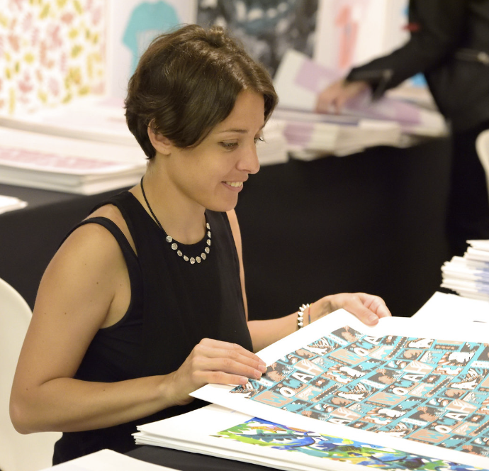
Really that’s all it took to convince him! Printsource is this August 13 and 14th. I’ll be heading there to walk the show, check it out, lurk at the booths and decide if it’s something I want to invest in and invest my time in preparing for next year.

Yep to quote Kathy Phantastic, I’m nerv-cited! and can wait to get back and tell you all about it!


Rust?! Is that even a colour?

I use colour as an act of rebellion against the boring and the blah of beige. My sunshiny modern illustrations, prints, patterns and designs are the antidote! Here’s why…

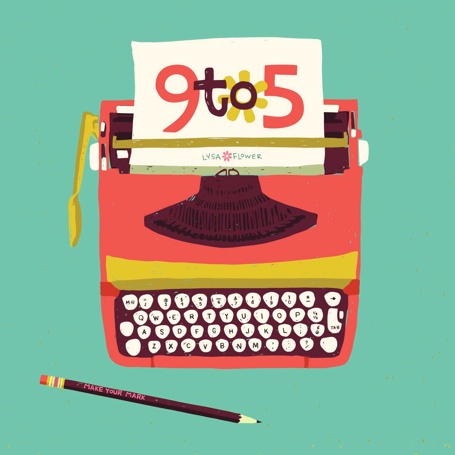
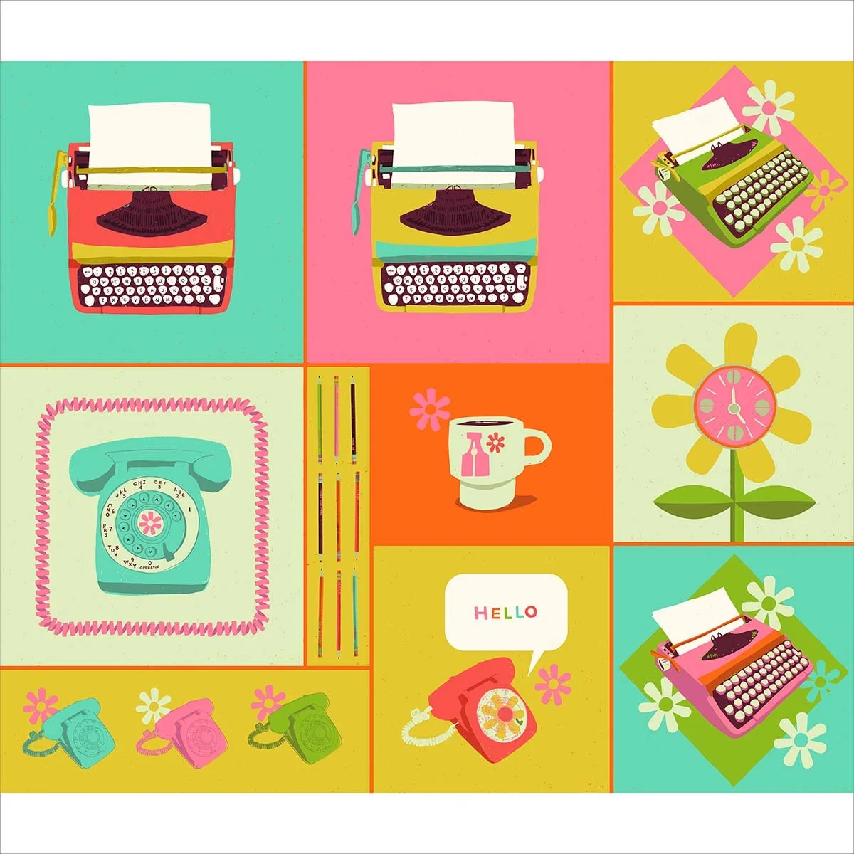
Growing up my mom was a secretary and I dedicated my 9 to 5 collection to her. That’s why there is an A on the cup, it’s the first letter of her name.

Like most moms she dressed me similarly to her taste, which was grey slacks and white blouses (yep blouses with skinny ribbons that went around the collar and tied in a bow). I also always had a cream cardigan.

The most wild colour I wore was a red blouse, but I’m here to tell you, it was the most muted of all reds. My barrettes were brown and beige and in grade 3 when I had to get glasses, can you guess what colour they were? Yep, beige!

BUT, I LONGED for the colorful barrettes and multi coloured wooly ties my best friend wore in her hair.

As a kid, when I was 7 or 8, I asked my mom what her favorite colour was. She said… wait for it…

RUST.

I looked at her blankly. Rust? I stared at her face. She wasn’t kidding. Rust.

“Like the stuff that grows on old Toyotas?” I asked.

She just looked at me blankly and said yes. Not wanting to hurt her feelings, I let it go but I walked away thinking, Rust? Rust? Is that even a colour?

At 10, I asked for my room to be painted yellow. We agreed on a colour and my mom started painting the closet and quickly decided it was WAY too bright. She promptly took the paint cans back and had more white added to them. My room ended up a shade of white, with a slight tinge of yellow. I took what I could get because the rest of our house had beige wallpaper, beige-y white painted walls. Everywhere I looked it was beige.

Maybe it’s no surprise colour is my act of rebellion. I crave it. I’ve never feared it. I can never have enough. It gives me dopamine hits like nobody’s business! When I see colours I love my instant reaction is to call them yummy! I get excited to use them and it’s my favorite part of the design process. I know some designers leave it to the end but I lead with it. I decide on a colour palette straight away.

So thank you mom! Thank you rust! And white tinges of yellow and of course beige! You have shaped me into radiating joyful, happy colours into peoples homes, neighbours and lives!


illustration, it’s a process


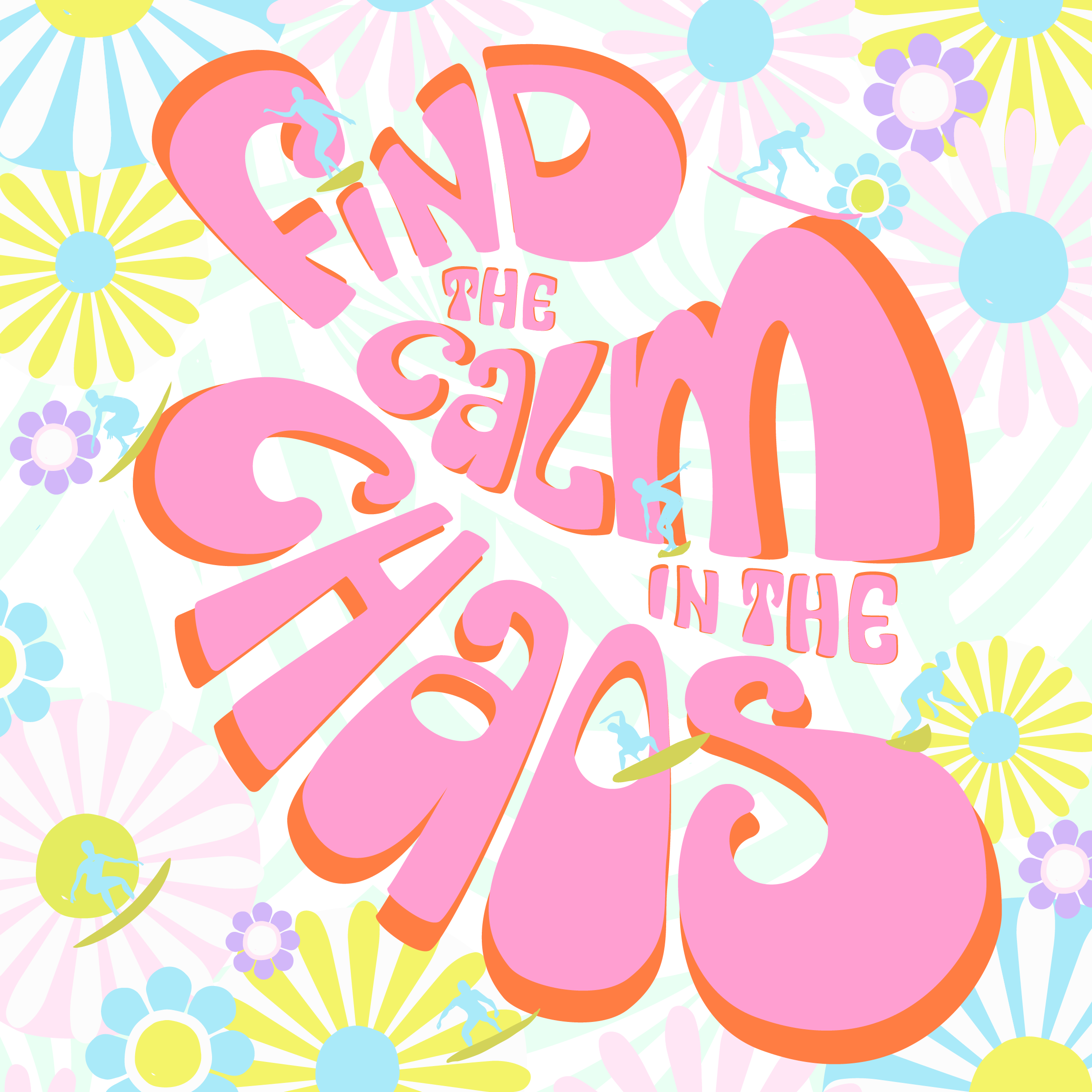
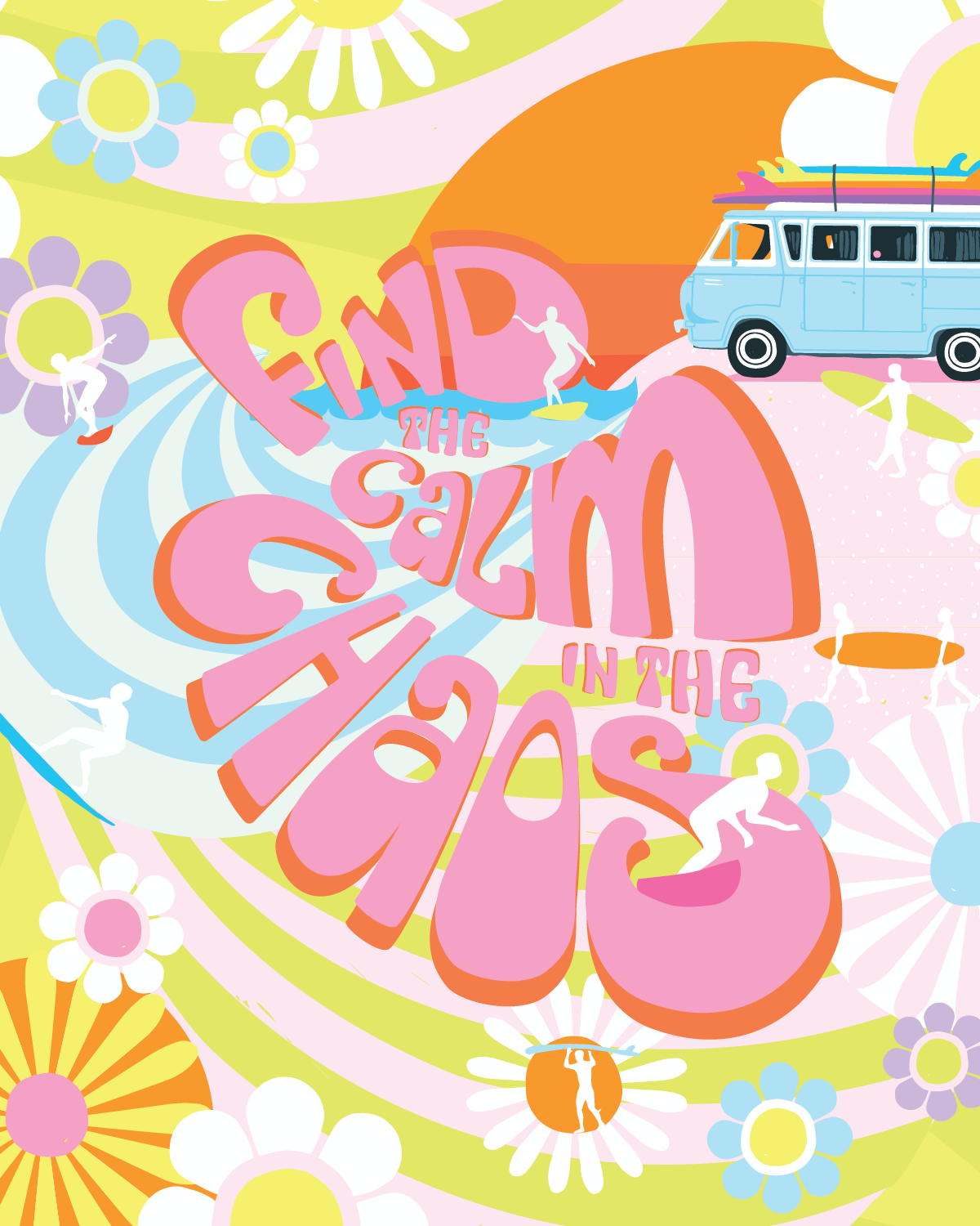
Find the Calm in the Chaos:: a change of background was the answer!

Trust me, the irony of how much I had to wrestle with this illustration was not lost on me. I won’t lie, I was feeling uncomfortable with how much time it was taking! I took a bit of a break and started to play with it again after some feedback from my husband and my Monday co-working group of fellow artists.. Above is what I came up with.

I’m finding gardening every morning very satisfying and to quote Blur in Park Life, “It gives me a sense of enormous well-being”. It’s also basically manual labour and switching tasks isn’t fatiguing for my brain. However, yesterday my son asked me to watch a YouTube video about productiveness (mostly I was listening because I had no idea what I was looking at in this League of Legends Streamer’s video). I LOVE what he had to say! And I loved even more that our 20 year old, was listening to him (saying stuff we’d been saying for some time now-ha! parenting!). Needless to say I love learning about ways to be more productive and my favourite Huberman Lab Podcast episode is with Dr Cal Newport: How to Enhance Focus and Improve Productivity. Which this steamer mentioned! See Kiddo, your mom is COOL! Ha!

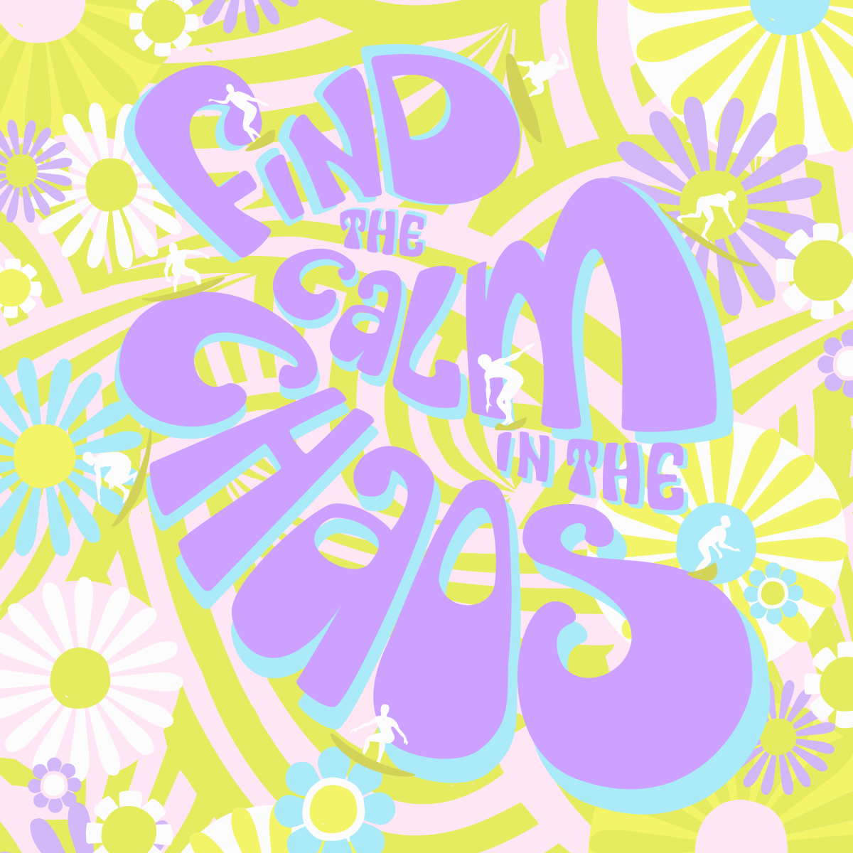
This is the square version.

Since then I’ve been wondering if I’d be happier dedicating a full day to design work, not just mornings. Knowing my time is up at lunch makes me feel a bit chaotic and it’s hard to relax into the design process. The brain change is well, a bit distracting and taxing.

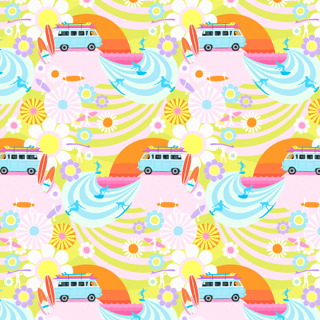
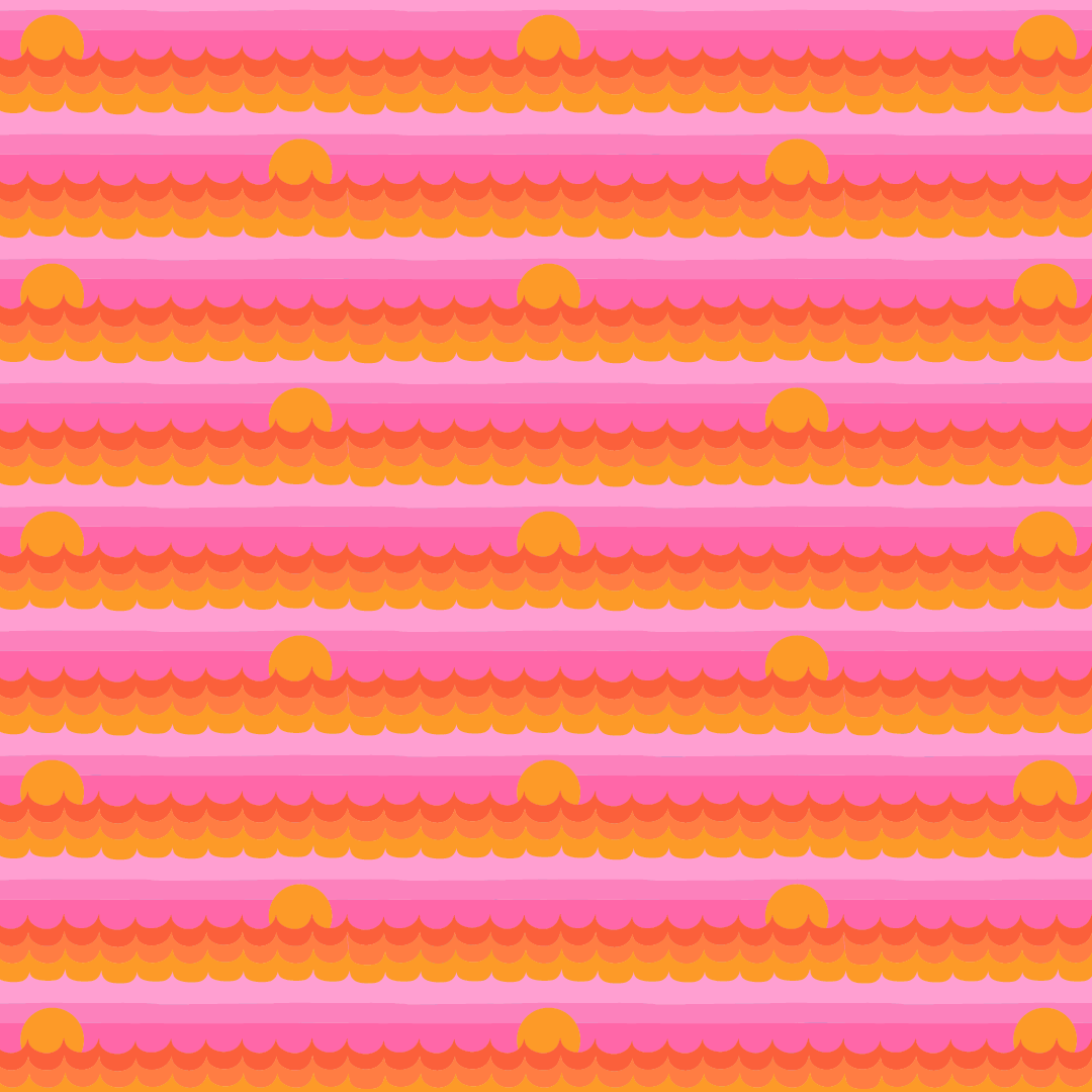
Either way, I worked on this illustration today after knowing it could be better and I didn’t want to settle with just alright. I thought, maybe I need to change the background? I loaded up the Endless Summer repeat and YEP! There it is! YES! I KNEW IT!

This is the 8x10 inch version

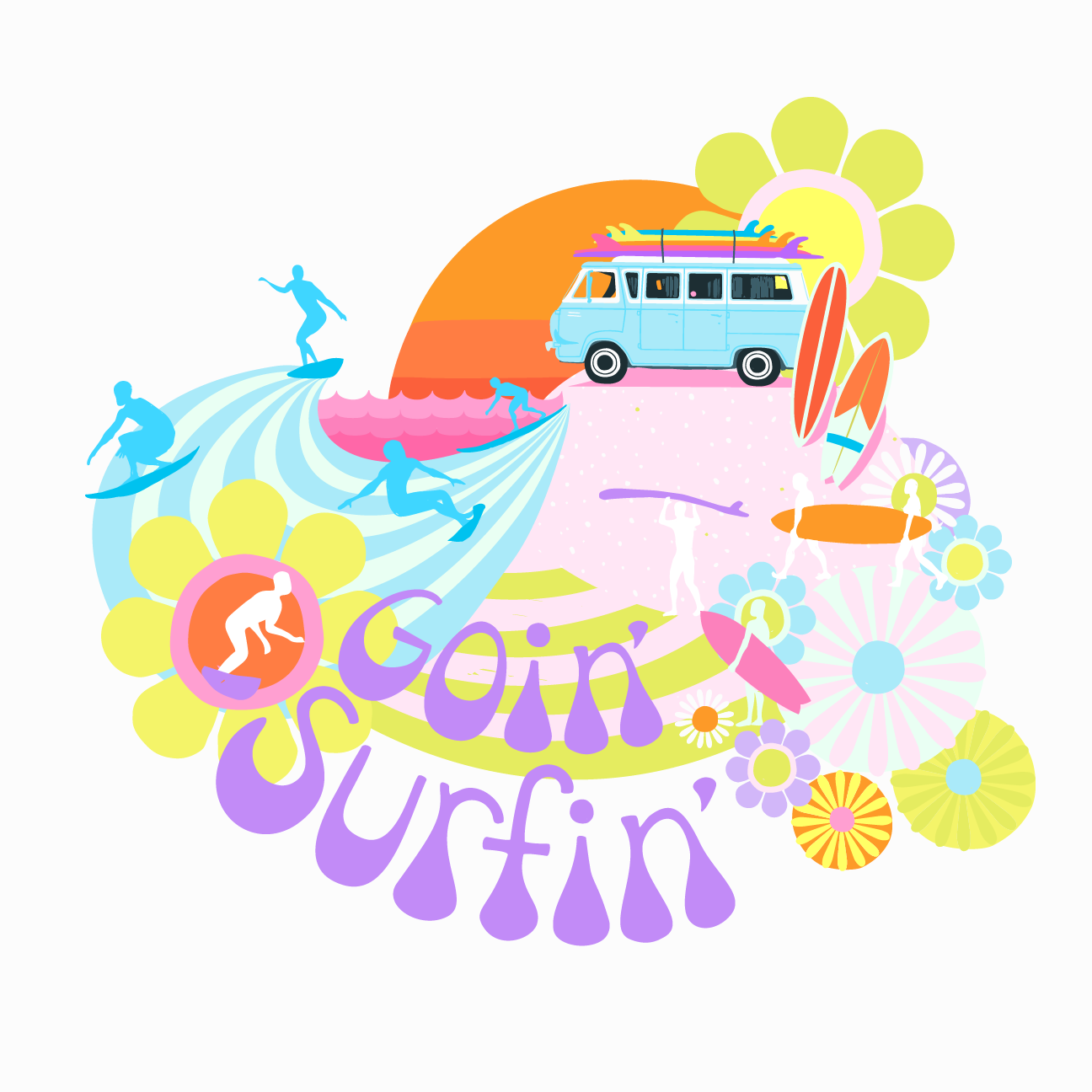
So to recap, last year after I had designed the Goin’ Surfin’ collection (after camping and surfing) I assumed, yep, that’s what this collection is about. Nope. It wasn’t until it was done that I realized for the last two years our lives had been turned upside down. We were sinking and taking on water. Our lives were total chaos. Think of the movie, “Everything, Everywhere all at Once” , that was us. Then, in the middle of it, and with help from the good people at The Foundry, we found the calm. Much, much needed calm in all that chaos.

My hope is that everything in your life never gets wildly out of control like ours did. However, if it does, please know this illustration is dedicated to bring you comfort & support.

 
Source: lysa-flowers-daily-designer-diary-find-the...

LET GO : : deep thoughts by Lysa Flower

I always have an vague idea of what I’m wanting to do with a piece. The journey, like many creatives have written about, is U shaped. Starting at the top of the U: "This is such a GREAT idea! (sketching and inking)". To the bottom of the U: "Ugh! Why is this falling apart in my hands (realizing it feels a little flat)". To climbing up the other side of the U: "Okay, that’s interesting, (breaking it on purpose, pushing the scale super large or super tiny) what if I?… to Wow! I LOVE THIS!".

That U feeling; it’s kind of like riding a wave I suppose... AND like the ability to LET GO of expectations, disappointment, each moment. When I really started to think about it, the need to LET GO might be the purpose of life… Whoa, that got deep fast! All I was trying to say was that I LOVE when hand lettering and patterns go together ;D


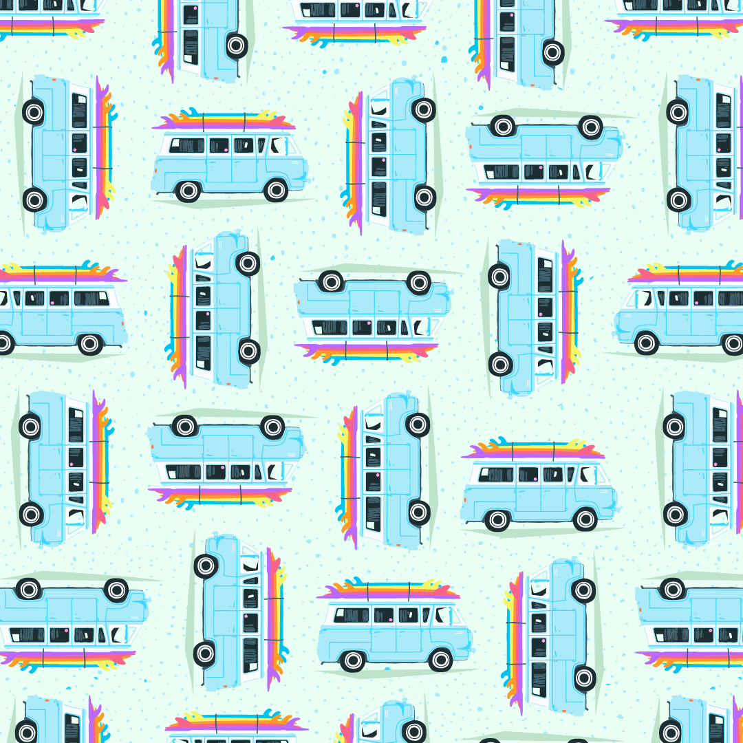
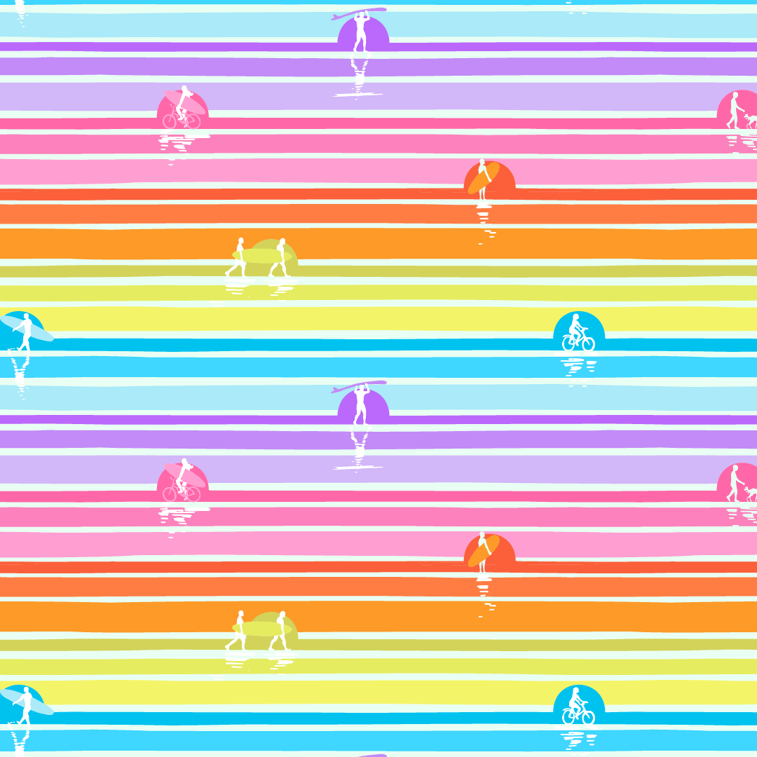
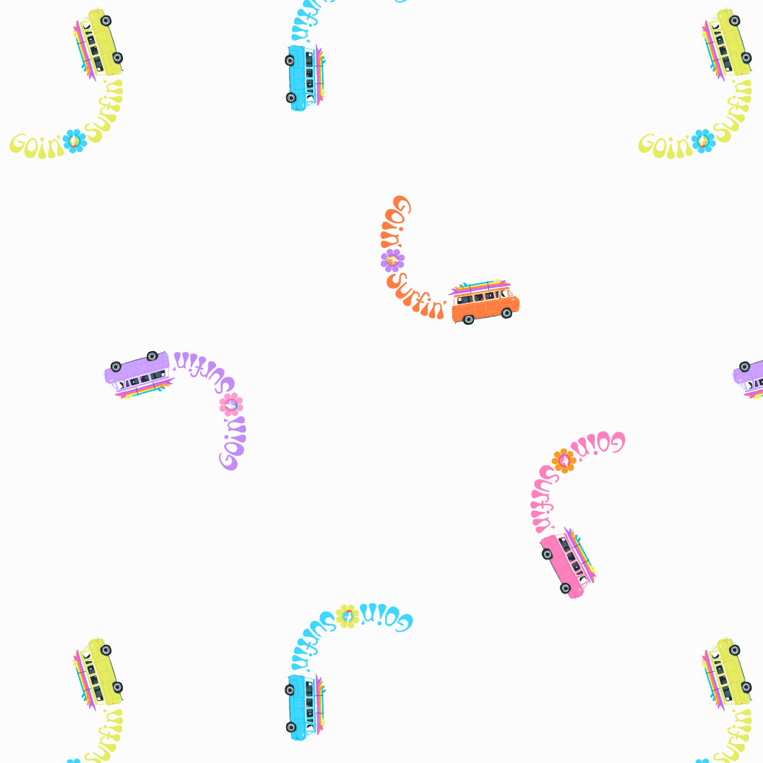
GOIN' SURFIN'::A NEW FABRIC COLLECTION MAKING A SPLASH!

I’m very excited to introduce my seventh collection licensed to Paintbrush Studio Fabrics called, Goin’ Surfin’. It’s being sold to stores now, so keep a look out at your local fabric store for it soon!

Sometimes collections come out of unexpected places. Last summer I had been working on a collection when an opportunity to go camping with some friends in Tofino popped up. We’re hotel-ers not campers, but we went for it anyways. Little did I know, taking this break would become a breakthrough for my collection too!

Often when I’ve finished a collection, I realize what it’s really about. Sure this collection is about surfboards, beaches, sand, waves… but to be honest the last two years have been tough on our family. The good news is we all learnt a lot about ourselves, we have all grown and are better for everything that happened. I won’t go into detail but let’s just say, when we were watching, “Everything Everywhere All at Once”, I looked at my husband and said, how is it possible they know this is our life! Minus the hot dog fingers of course.

I realized, especially in the making of the wave print, how important it’s been to let go. Let go of the past, to what we perceived as our future. Let go of expectations. Let go of strangling the moment, instead of letting it arrive naturally.

Even though I never fully stood up on a surfboard, I did catch some waves that took off and it was shocking how fast it was. When that happened I was like, “OH… I get it!”… all I had to do was to let go.

I also realized how important it was to find the calm in the chaos. While trying to learn to surf, waves crash into you, or you fall off your board (there’s a reason they call it the drink!). It can be hard to find your footing, on the board and in the sand. Like our last two years, just as we got up again a new wave would come and crash into us. It was hard for us to catch our breath but eventually we found the calm in the chaos and it’s a beautiful view.

So my hope for this fun summer collection: not only does it fill you with endless inspiration for summer sewing projects, I hope it also helps you let go and find calm in the chaos in this thing called life (imaging those last few words being said like Prince’s Let’s Go Crazy intro!)… and speaking of music, as I do with each collection, I create a playlist early in my workflow. You can listened to my Goin’ Surfin’ playlist HERE.

 

I DECLARE 2018 THE YEAR OF ZINNIA: WARRIOR PRINCESS

I'm back from my winter hibernation and I couldn't wait to check in with you before next Tuesday. I hope you had a cozy winter break. Happy New Year! 

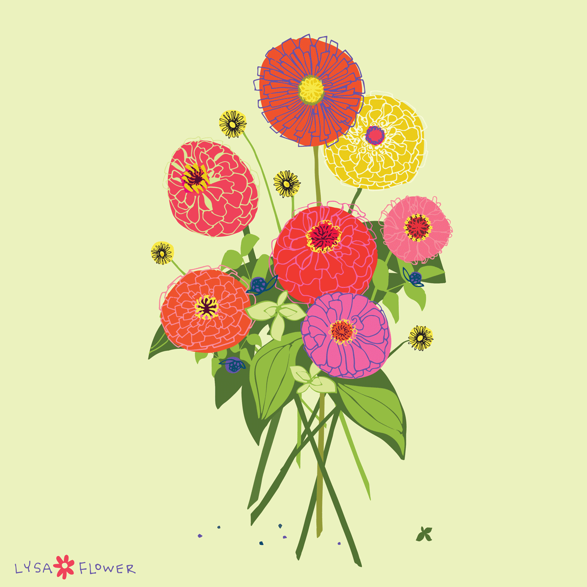
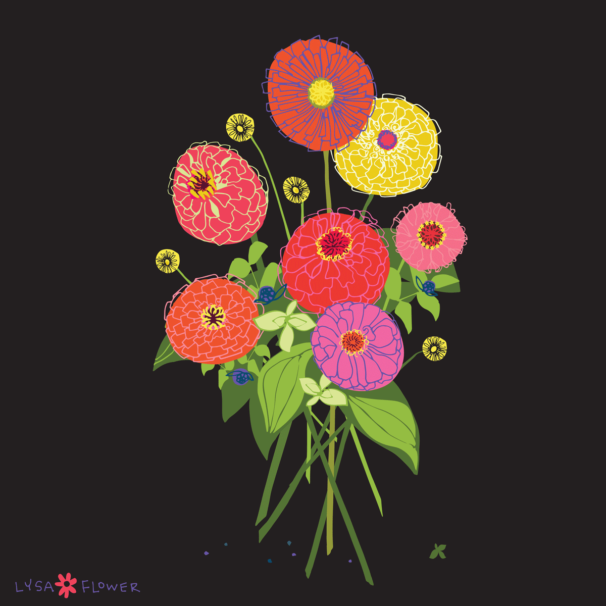
Over the break I snuck in some time to experiment with Adobe Illustrator. As inspiration I used some photos of zinnias I took last September at Krauss Berry Farms in Langley. I know it's a loose comparison but zinnia reminds me of Xena: the Warrior Princess. Do remember that from TV show from the 90's? I never watched it a ton but gosh I LOVED her battle cry. Zinnia's have strong stems, they don't apology for their bold colour and they're not delicate and frou-frou, like some flowers. Hello roses, such diva's needing to be pruned with all those testy thorns. See what I mean, zinnia's, they're Warrior Princesses! Like Lucy Lawless... and I bet they'd have the same battle cry. 

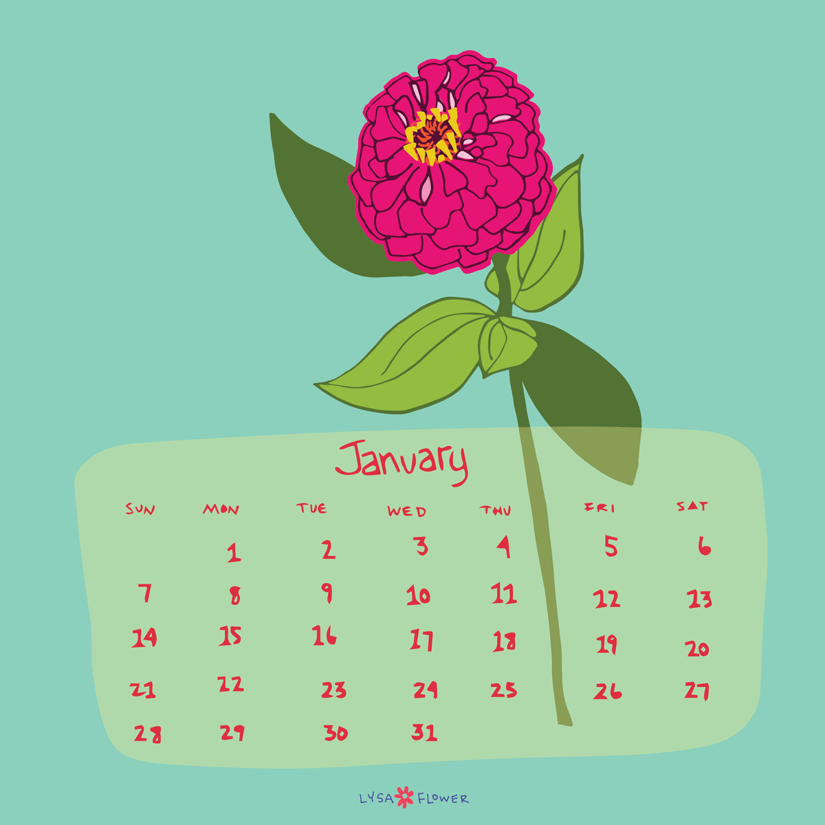
Now I couldn't decide if I liked the black or the cream background best so I made both into PDF's for you. Click HERE for black and click HERE for white. Also when I was playing around I  made a January calendar page for you! Click HERE.

Keeping with tradition of my RECOMMENDATIONS: I recently discovered Andy J Pizza's podcast "Creative Pep Talk" via the Jealous Curator. He's entertaining to listen to while working in the studio and he's always recommending other podcasts and books. Oh and he just published a book under the same title! Which reminds me, yesterday I picked up Lisa Congdon's new book, A Glorious Freedom: Older Women Leading Extraordinary Lives. I'm excited about digging into it!

And finally RECOMMENDED for your playlist: Check out Kim Kight's Snap to Grid PLAYLIST. It's well worth subscribing to Spotify for, although I miss the videos... I'm such an 80's kid.