illustration, it’s a process


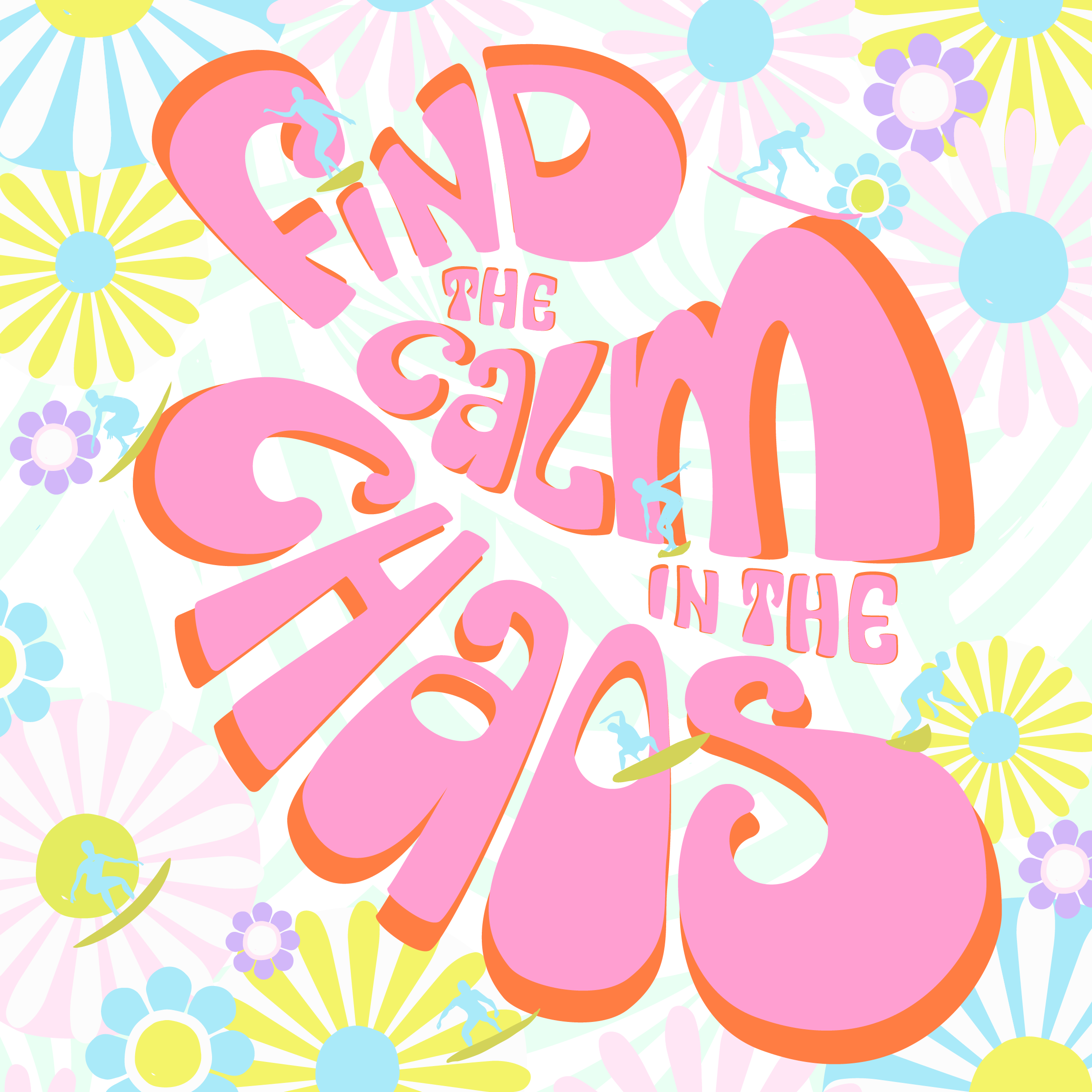
Find the Calm in the Chaos:: a change of background was the answer!

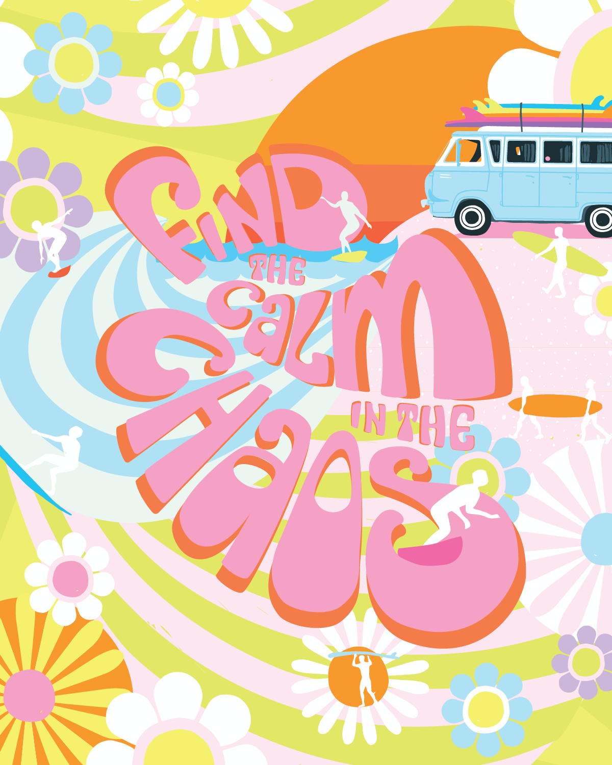
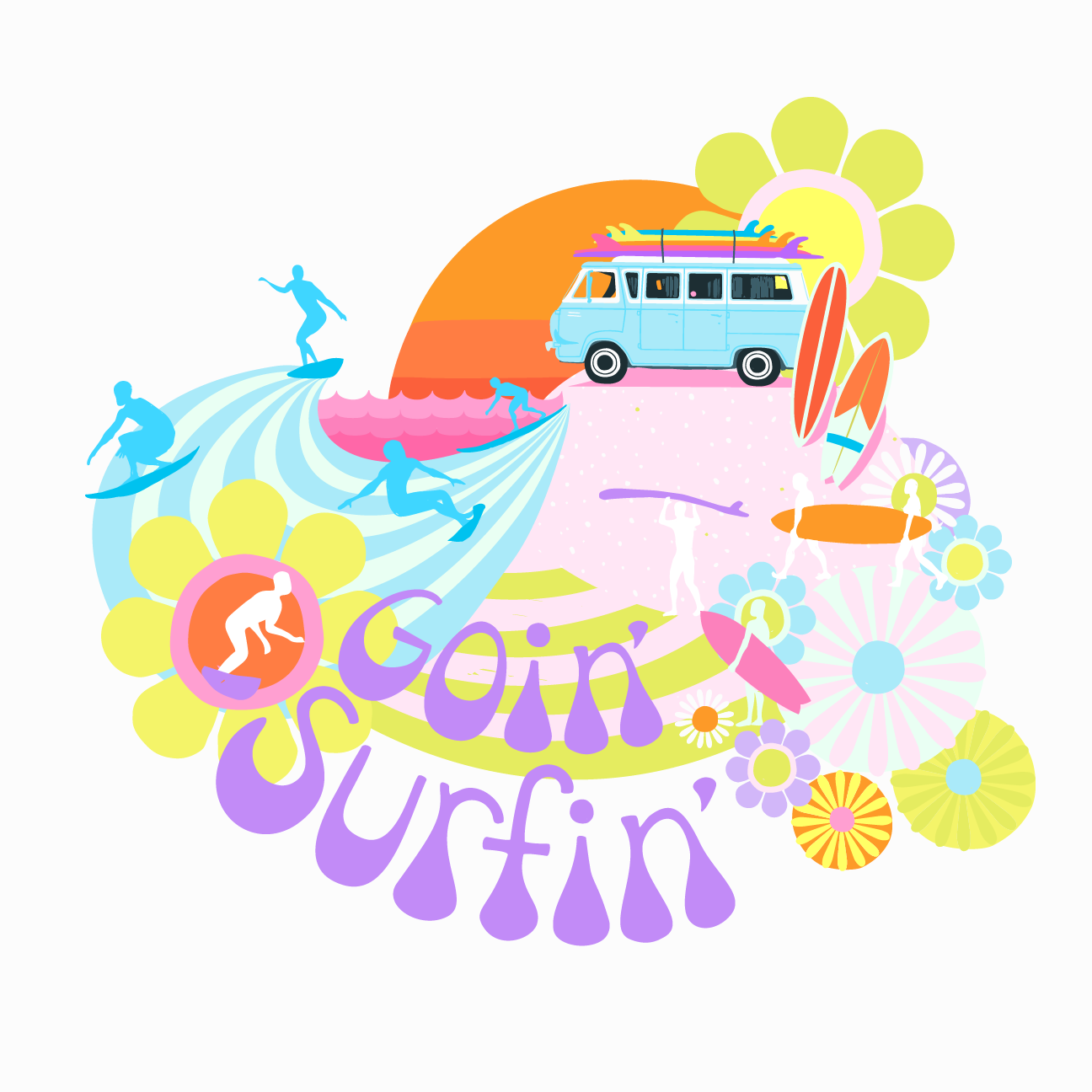
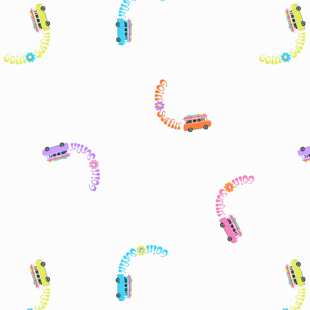
Trust me, the irony of how much I had to wrestle with this illustration was not lost on me. I won’t lie, I was feeling uncomfortable with how much time it was taking! I took a bit of a break and started to play with it again after some feedback from my husband and my Monday co-working group of fellow artists.. Above is what I came up with.

I’m finding gardening every morning very satisfying and to quote Blur in Park Life, “It gives me a sense of enormous well-being”. It’s also basically manual labour and switching tasks isn’t fatiguing for my brain. However, yesterday my son asked me to watch a YouTube video about productiveness (mostly I was listening because I had no idea what I was looking at in this League of Legends Streamer’s video). I LOVE what he had to say! And I loved even more that our 20 year old, was listening to him (saying stuff we’d been saying for some time now-ha! parenting!). Needless to say I love learning about ways to be more productive and my favourite Huberman Lab Podcast episode is with Dr Cal Newport: How to Enhance Focus and Improve Productivity. Which this steamer mentioned! See Kiddo, your mom is COOL! Ha!

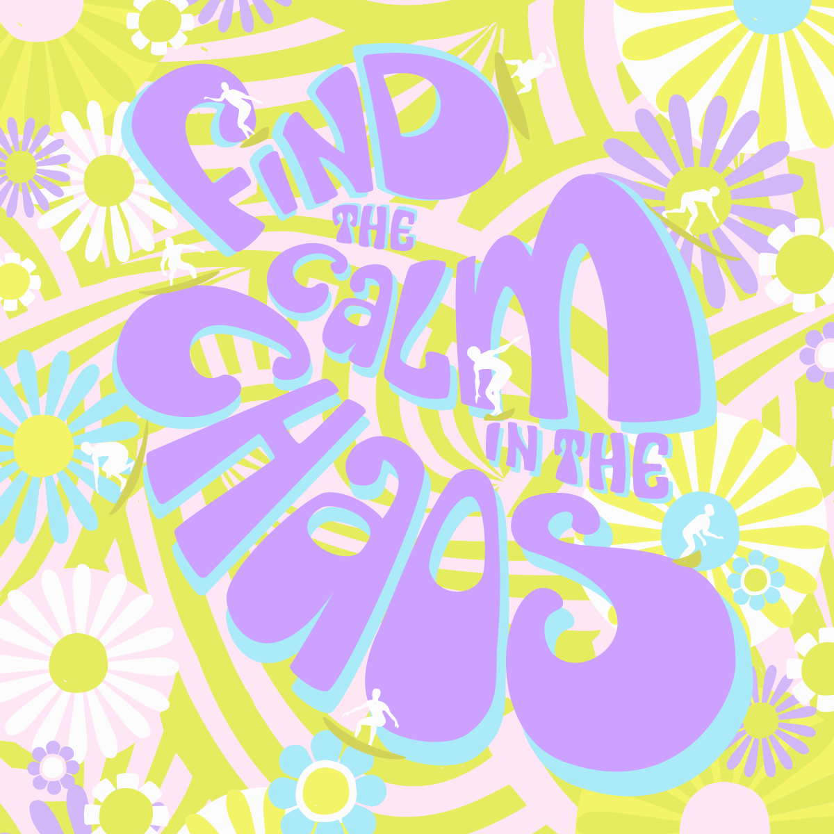
This is the square version.

Since then I’ve been wondering if I’d be happier dedicating a full day to design work, not just mornings. Knowing my time is up at lunch makes me feel a bit chaotic and it’s hard to relax into the design process. The brain change is well, a bit distracting and taxing.

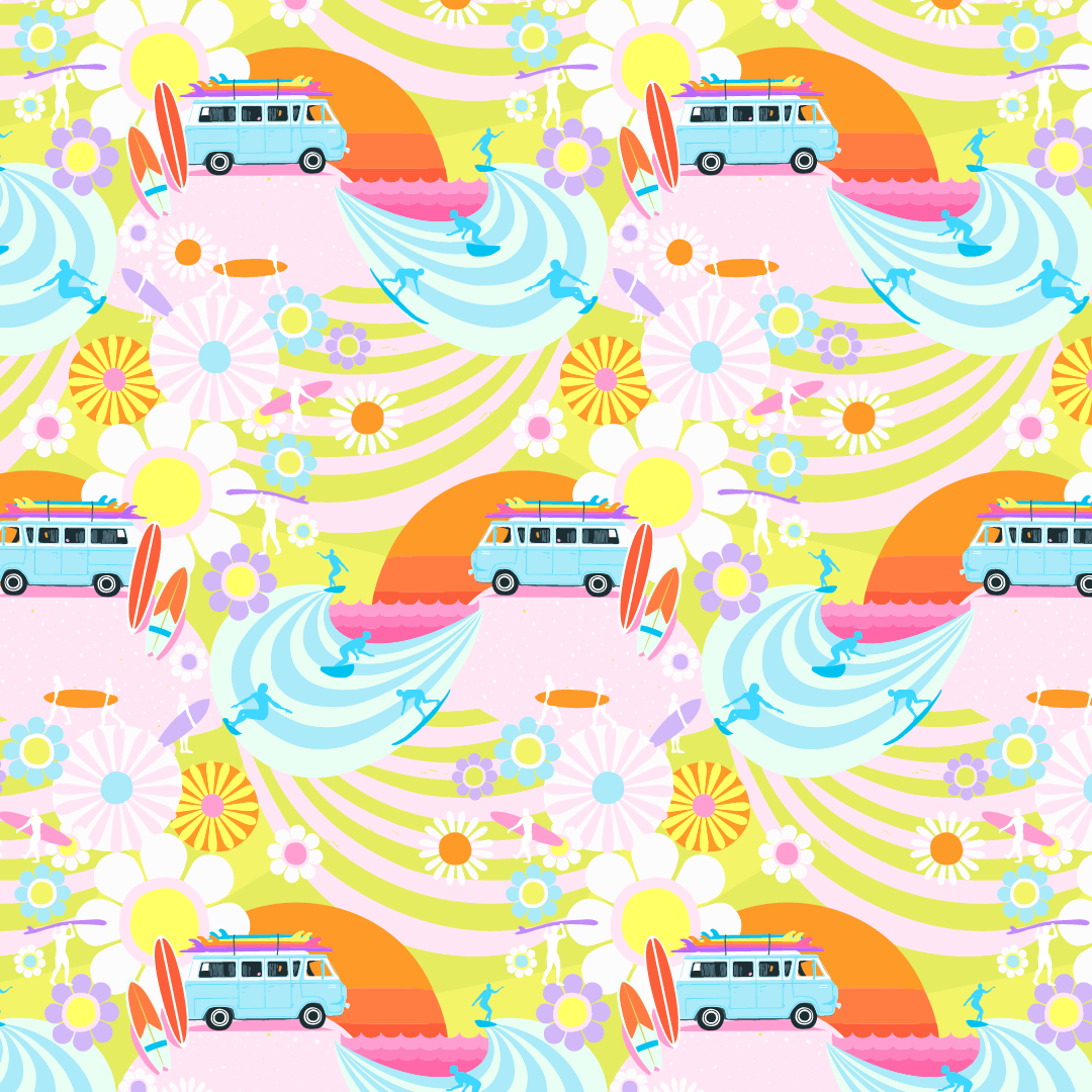
Either way, I worked on this illustration today after knowing it could be better and I didn’t want to settle with just alright. I thought, maybe I need to change the background? I loaded up the Endless Summer repeat and YEP! There it is! YES! I KNEW IT!

This is the 8x10 inch version

So to recap, last year after I had designed the Goin’ Surfin’ collection (after camping and surfing) I assumed, yep, that’s what this collection is about. Nope. It wasn’t until it was done that I realized for the last two years our lives had been turned upside down. We were sinking and taking on water. Our lives were total chaos. Think of the movie, “Everything, Everywhere all at Once” , that was us. Then, in the middle of it, and with help from the good people at The Foundry, we found the calm. Much, much needed calm in all that chaos.

My hope is that everything in your life never gets wildly out of control like ours did. However, if it does, please know this illustration is dedicated to bring you comfort & support.

 
Source: lysa-flowers-daily-designer-diary-find-the...

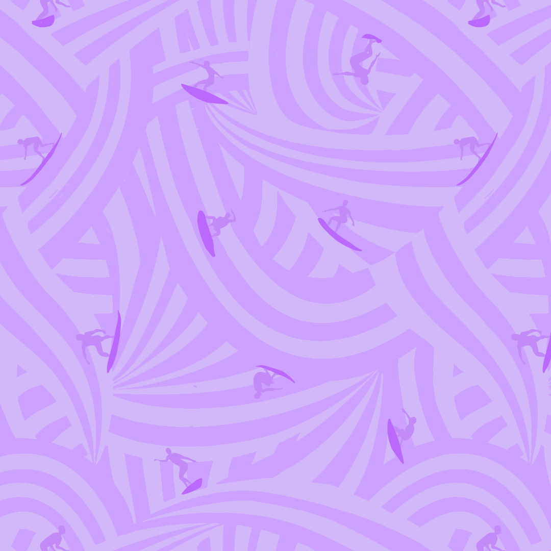
PRETTY PLEASED ABOUT PURPLE!

… BEFORE IT USED TO MAKE ME PUKE! Okay well that’s a bit dramatic but it has been on my “No thank you” list for a long time. When I started designing for my Goin’ Surfin’ collection I wanted to push my colour palette and decided now was the time to make friends with purple. I had done it with grey about ten years ago, so I knew it was possible. Have you ever had a colour aversion?

I think A LOT about colour and I’m curious about these aversions. I don’t know what it’s like for you but for me colour is instinctual. I’ve taken all the colour theory courses, but to be honest, I can never remember all the rules. All I know is when I use certain colours or combinations they give me strong feelings that I react to.

I know about the symbolism of colour, which I find surprisingly conflicting for some colours (like yellow which can be both happy and anxious). I know purple is a hard colour to make and that’s why it was reserved for royalty, but that never helped me warm up to it.
Then there’s a psychology to colour but I think it gets muddy with your personal relationship to it. Let’s say a colour was a hot trend when you were a kid, for example avocado green, and you have memories of your mom making you peanut butter and jelly sandwiches as you basked in your avocado green kitchen. You might have warm fuzzy feelings whenever you see avocado green but others might have the exact opposite reaction to it.

When it comes down to it, I think the specific hue is the important factor to making friends with a colour. For example, my father in law and I both love yellow. Except, he loves school bus yellow and I love a bright lemon yellow. To me, it’s not the same colour at all! Kind of like growing up with other Lisa’s in my class room. I didn’t think of our names as the same ever, even though they sounded the same!

So in the end, I searched and found a hue of purple I adored and used in Goin’ Surfin’. Not only did I stretch my colour palette, I finally made friends with purple and I LOVE what it did for this collection, especially my Sunshine Floral! Those pops of purple really made it sing!


MAKING WAVES FOR SURFERS!

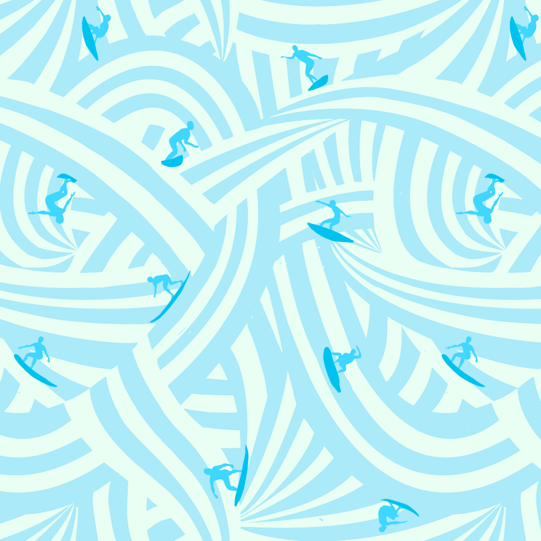
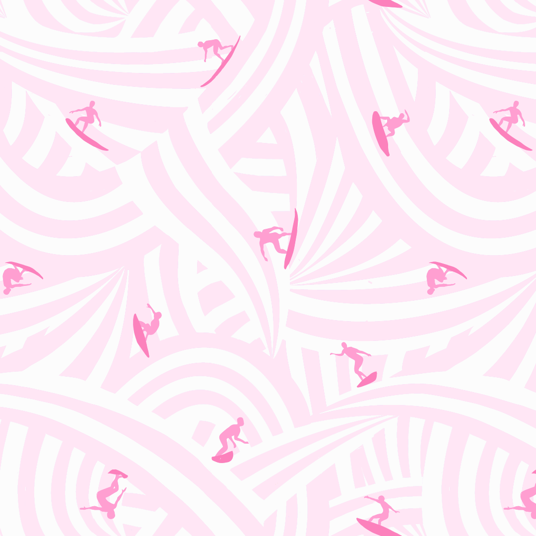
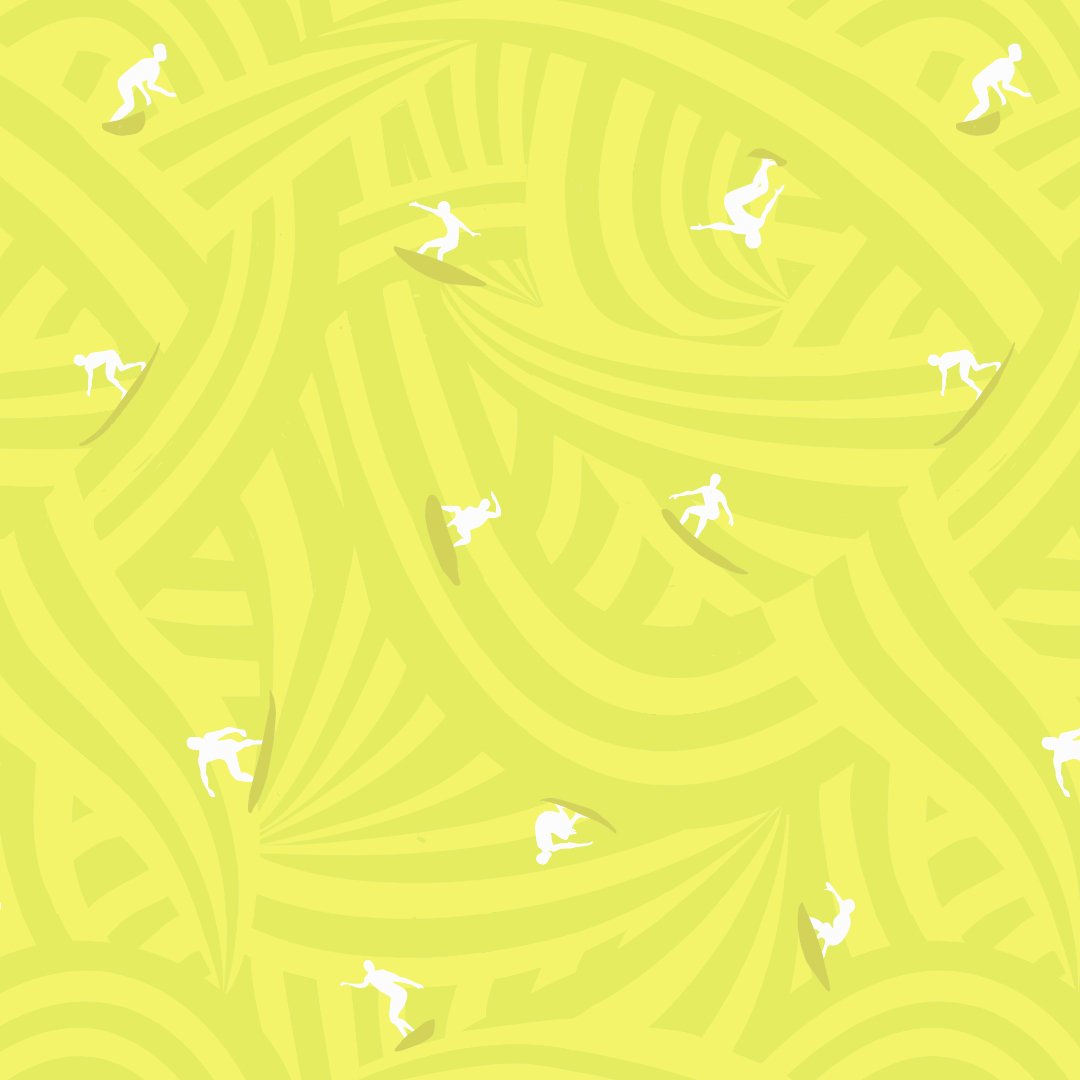
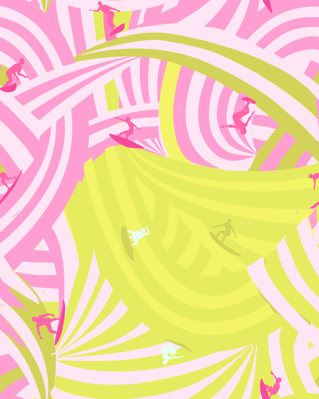
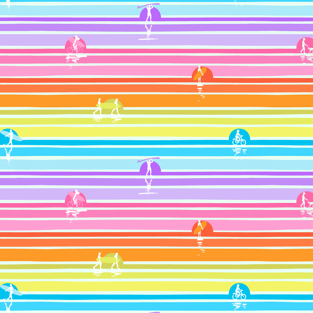
Designing the waves of this intricate surfer print was one of my favourite design challenges in this Goin’ Surfin’ fabric collection!

Once I got my head wrapped around the repeat, and realized I needed to bring each wave to a point (otherwise it looked like toothpaste, ha, ha!) AND then when I put the surfer silhouettes on the waves, it was pure joy!

Then of course I played with ALL the colours (my very favourite thing to do!)! While I didn’t end up using the pink and yellow waves for the surfers I did end using it for the base of the sunshine floral!

In the end we went with the above colourways. ALL of them I’d LOVE to swim in! Or Surf! :D


GOIN' SURFIN'::A NEW FABRIC COLLECTION MAKING A SPLASH!

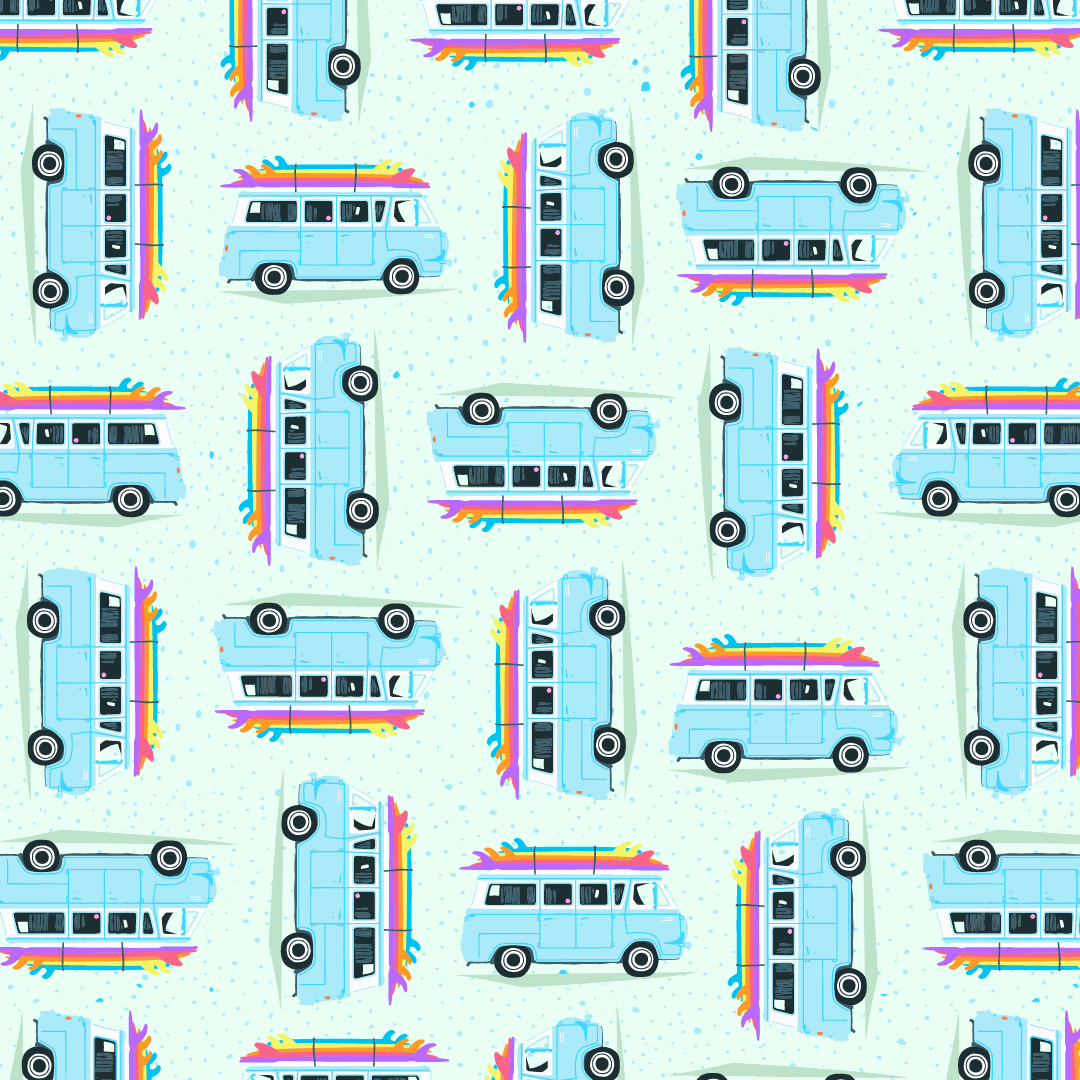
I’m very excited to introduce my seventh collection licensed to Paintbrush Studio Fabrics called, Goin’ Surfin’. It’s being sold to stores now, so keep a look out at your local fabric store for it soon!

Sometimes collections come out of unexpected places. Last summer I had been working on a collection when an opportunity to go camping with some friends in Tofino popped up. We’re hotel-ers not campers, but we went for it anyways. Little did I know, taking this break would become a breakthrough for my collection too!

Often when I’ve finished a collection, I realize what it’s really about. Sure this collection is about surfboards, beaches, sand, waves… but to be honest the last two years have been tough on our family. The good news is we all learnt a lot about ourselves, we have all grown and are better for everything that happened. I won’t go into detail but let’s just say, when we were watching, “Everything Everywhere All at Once”, I looked at my husband and said, how is it possible they know this is our life! Minus the hot dog fingers of course.

I realized, especially in the making of the wave print, how important it’s been to let go. Let go of the past, to what we perceived as our future. Let go of expectations. Let go of strangling the moment, instead of letting it arrive naturally.

Even though I never fully stood up on a surfboard, I did catch some waves that took off and it was shocking how fast it was. When that happened I was like, “OH… I get it!”… all I had to do was to let go.

I also realized how important it was to find the calm in the chaos. While trying to learn to surf, waves crash into you, or you fall off your board (there’s a reason they call it the drink!). It can be hard to find your footing, on the board and in the sand. Like our last two years, just as we got up again a new wave would come and crash into us. It was hard for us to catch our breath but eventually we found the calm in the chaos and it’s a beautiful view.

So my hope for this fun summer collection: not only does it fill you with endless inspiration for summer sewing projects, I hope it also helps you let go and find calm in the chaos in this thing called life (imaging those last few words being said like Prince’s Let’s Go Crazy intro!)… and speaking of music, as I do with each collection, I create a playlist early in my workflow. You can listened to my Goin’ Surfin’ playlist HERE.