ENDLESS SUMMER : : VANS

One of the very best parts of Tofino, other than the beaches and waves, is Tacofino, a parked food truck that serves tacos and my very favourite, Diablo cookies!

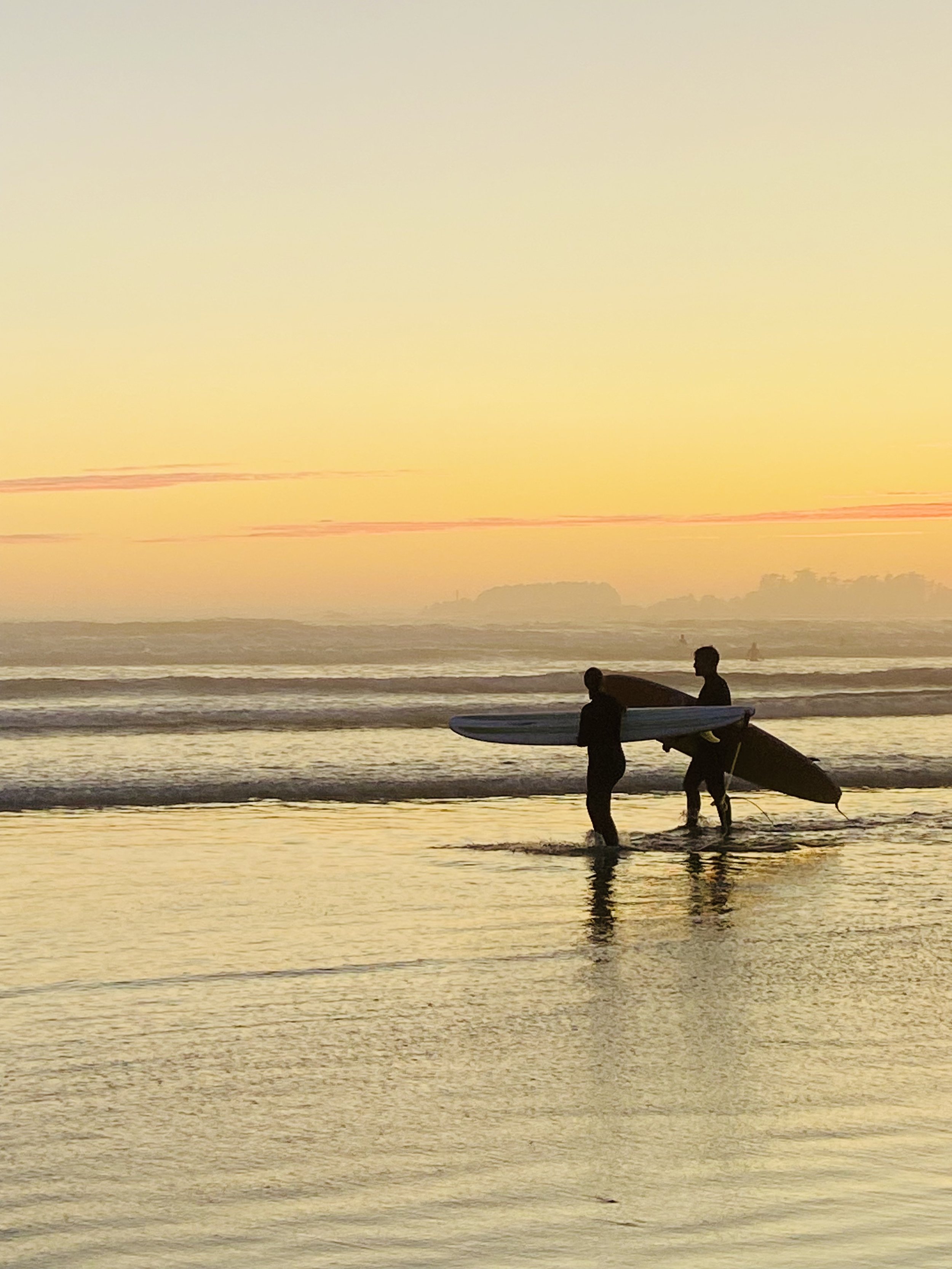
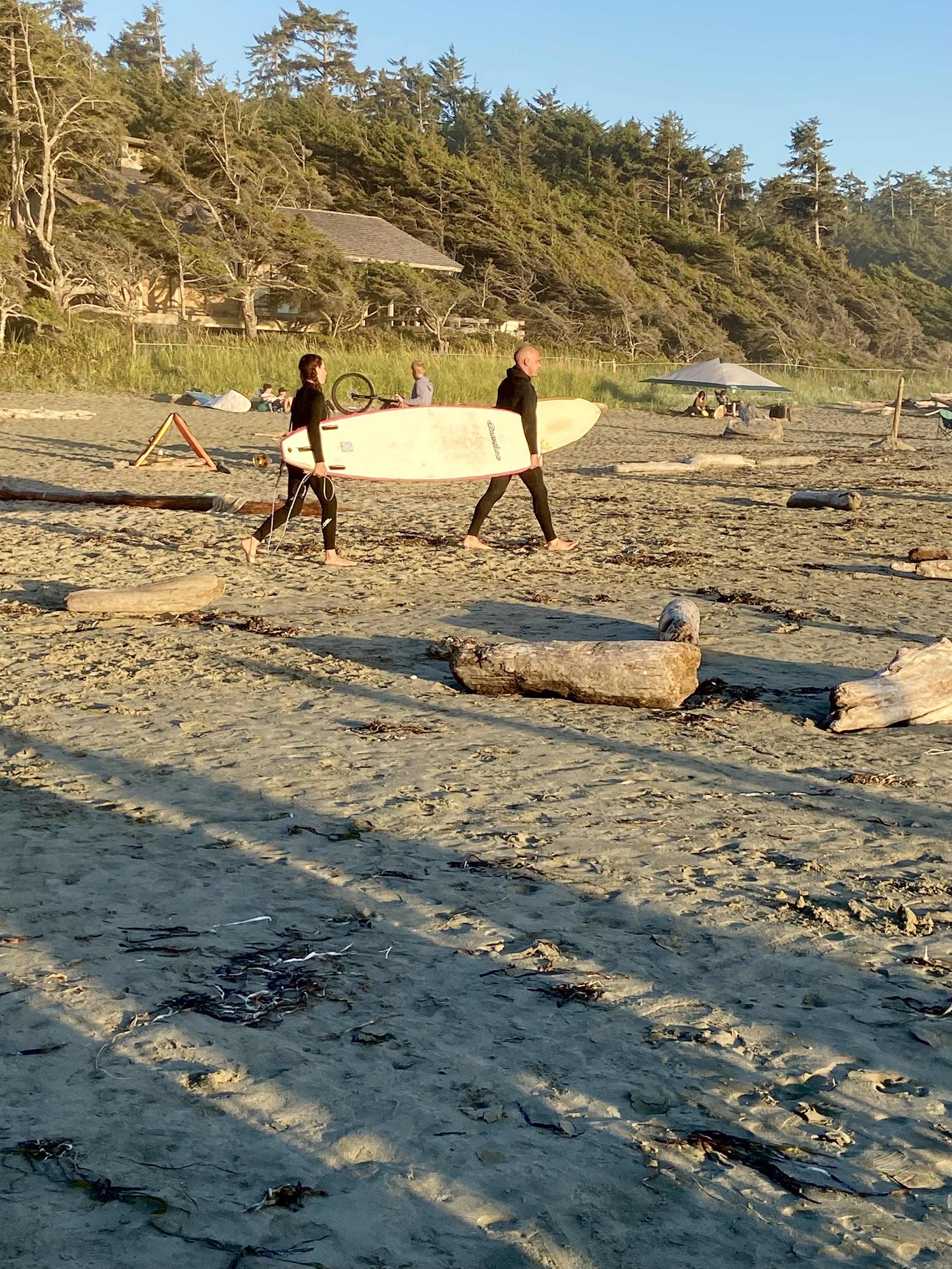
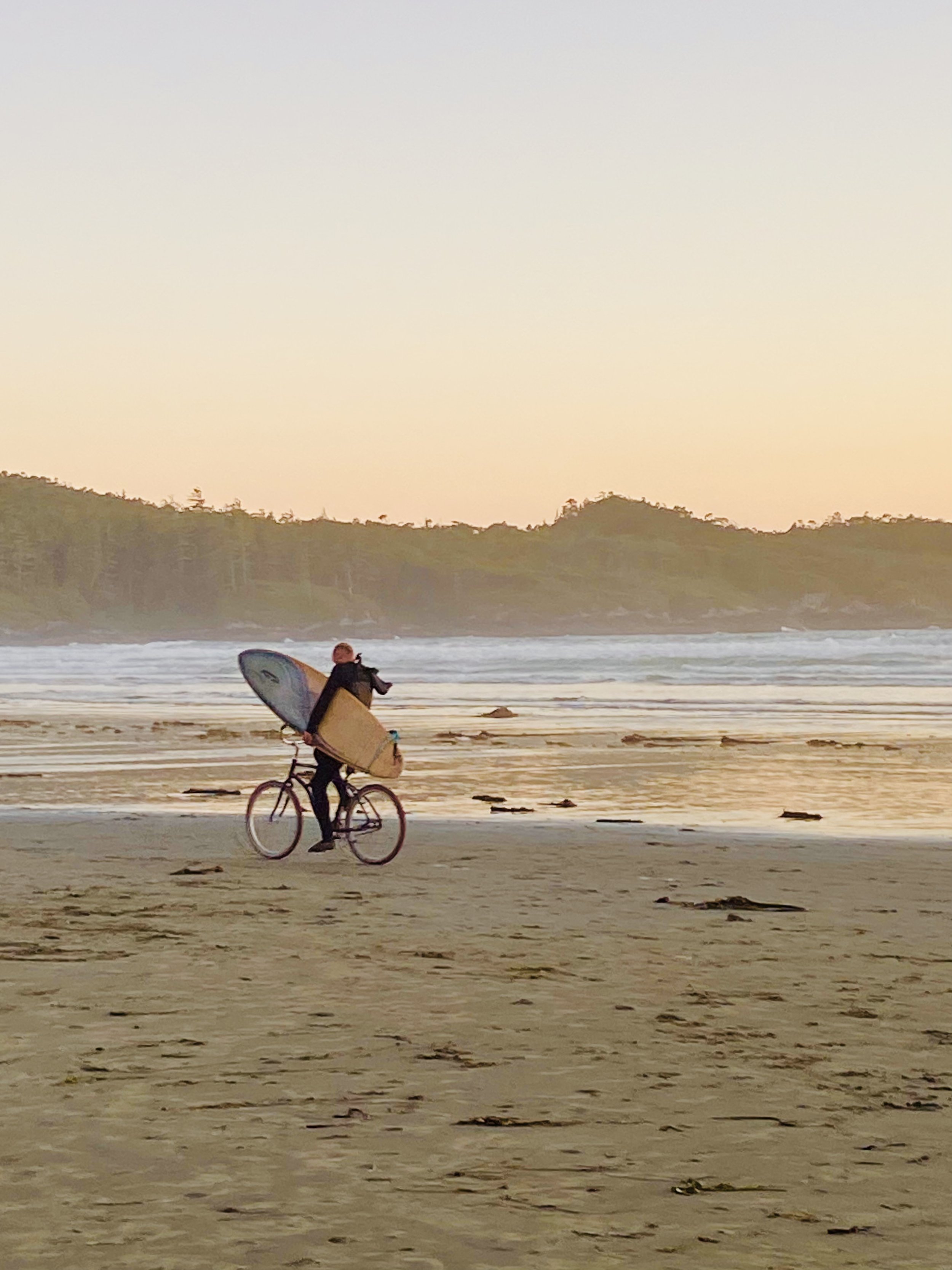
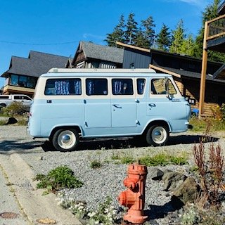
So there we were, after a day of attempted surfing (but successful boogie boarding), we thought we’d head into town to Tacofino. As we were driving to it we saw it! The most beautiful van I had ever seen…

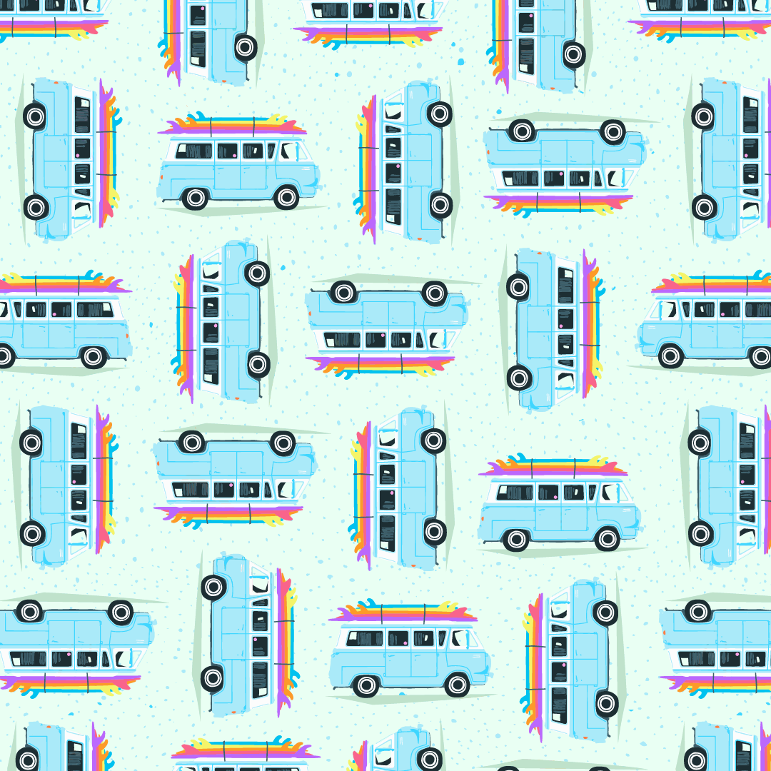
The next day we went back to Tacofino for round two, and we also enjoyed ice-cream at Chocolate Tofino. While waiting in line for the ice cream I noticed this chalkboard painting of a van with surfboards stacked extremely high on it (I thought it was funny and took a very fuzzy photo of it). While I didn’t stack my surfboards that high on my vans they definitely influenced mine! Inspiration was everywhere on this trip!

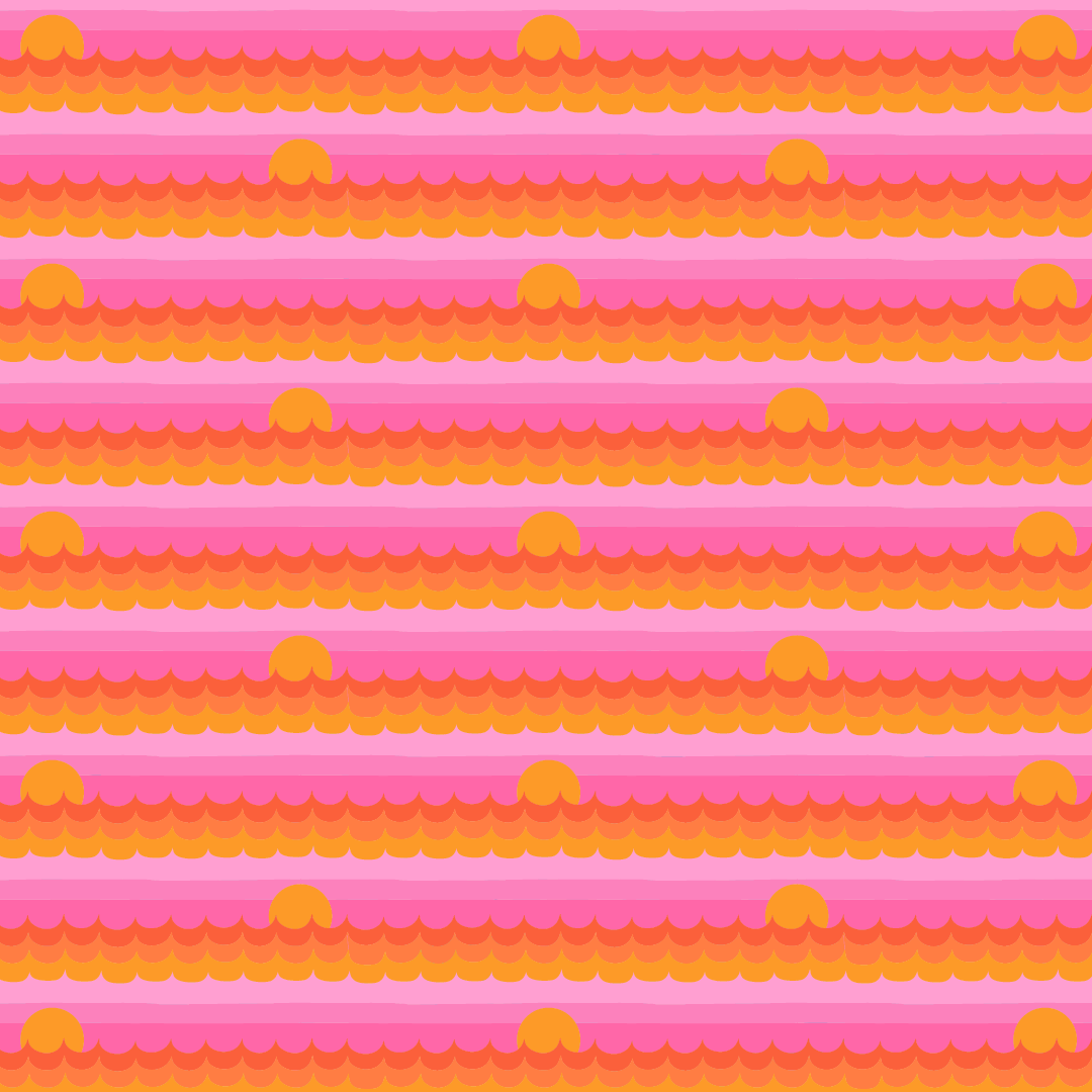
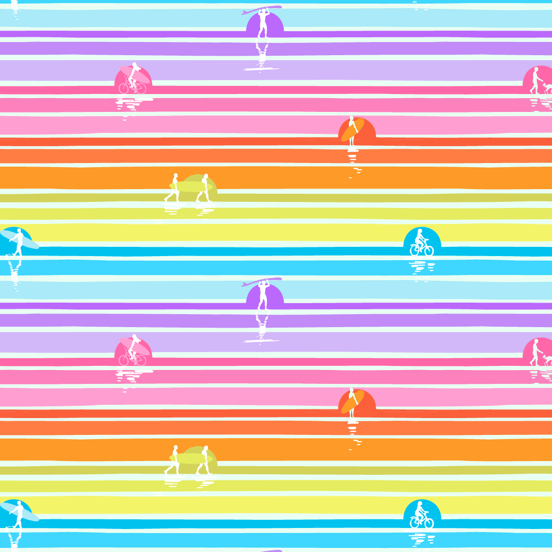
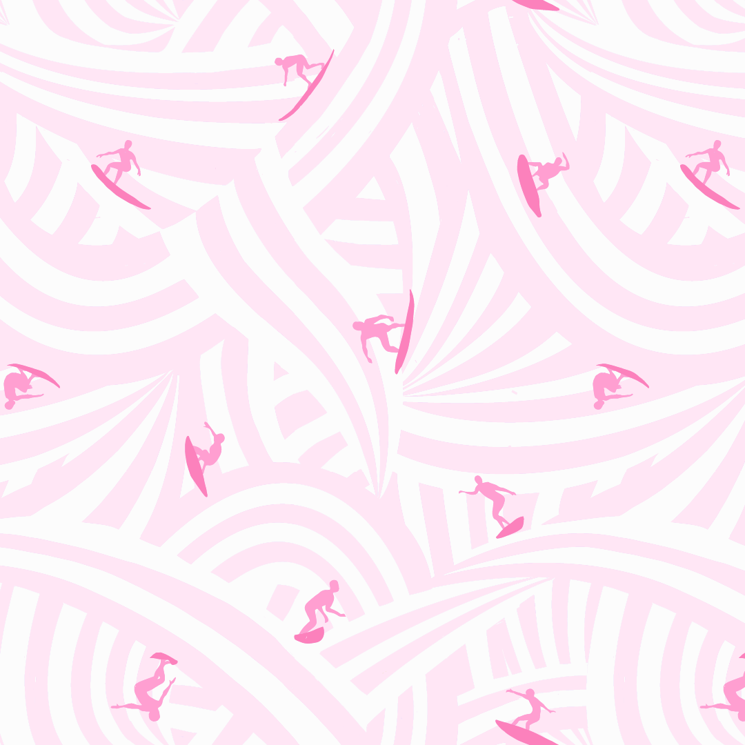
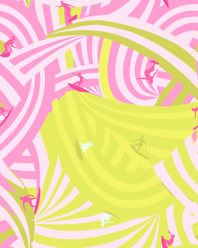
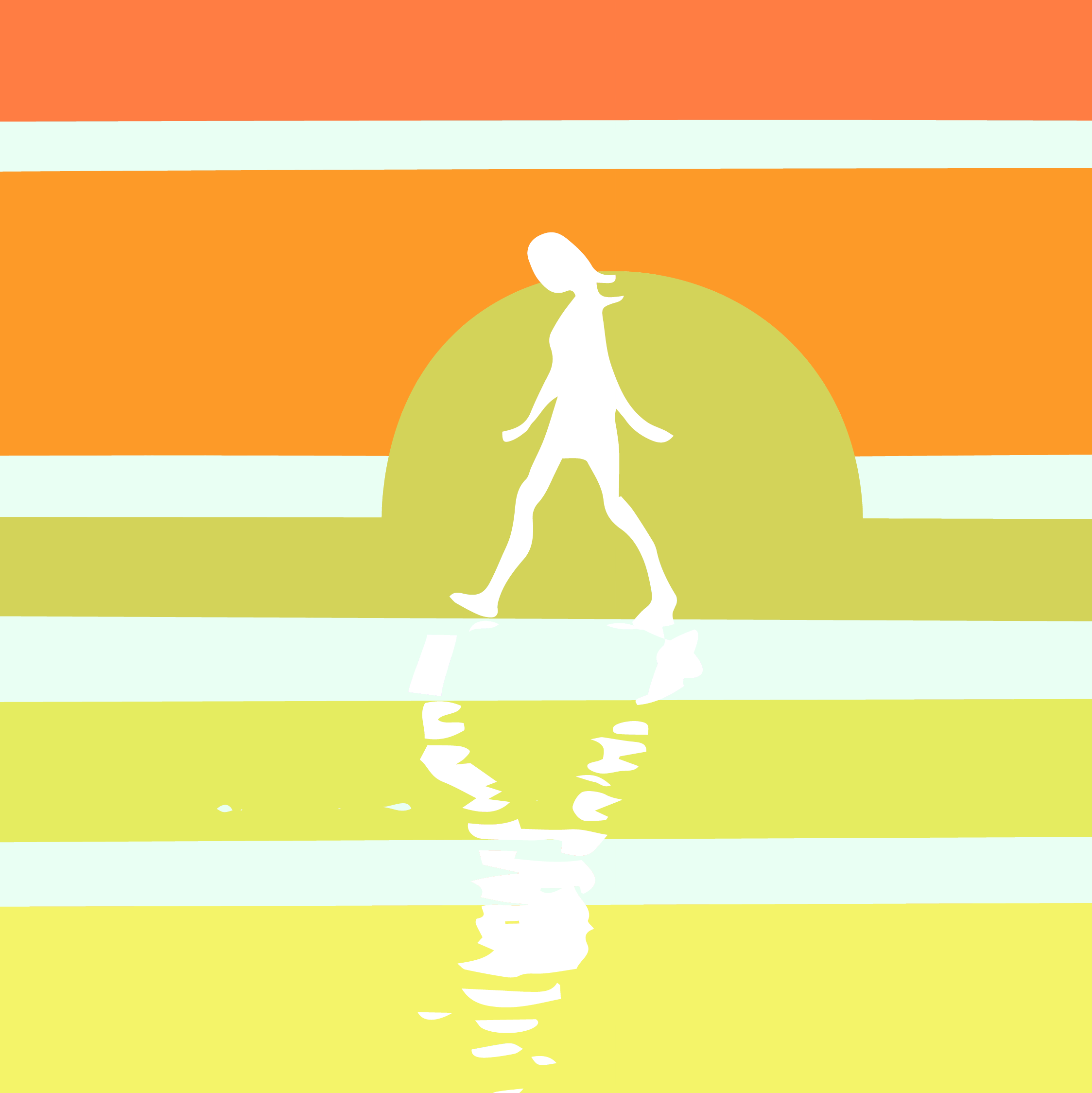
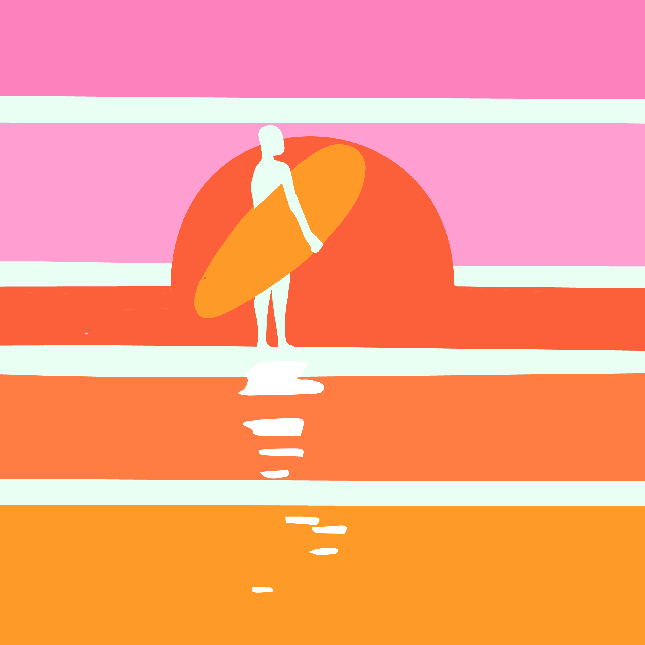
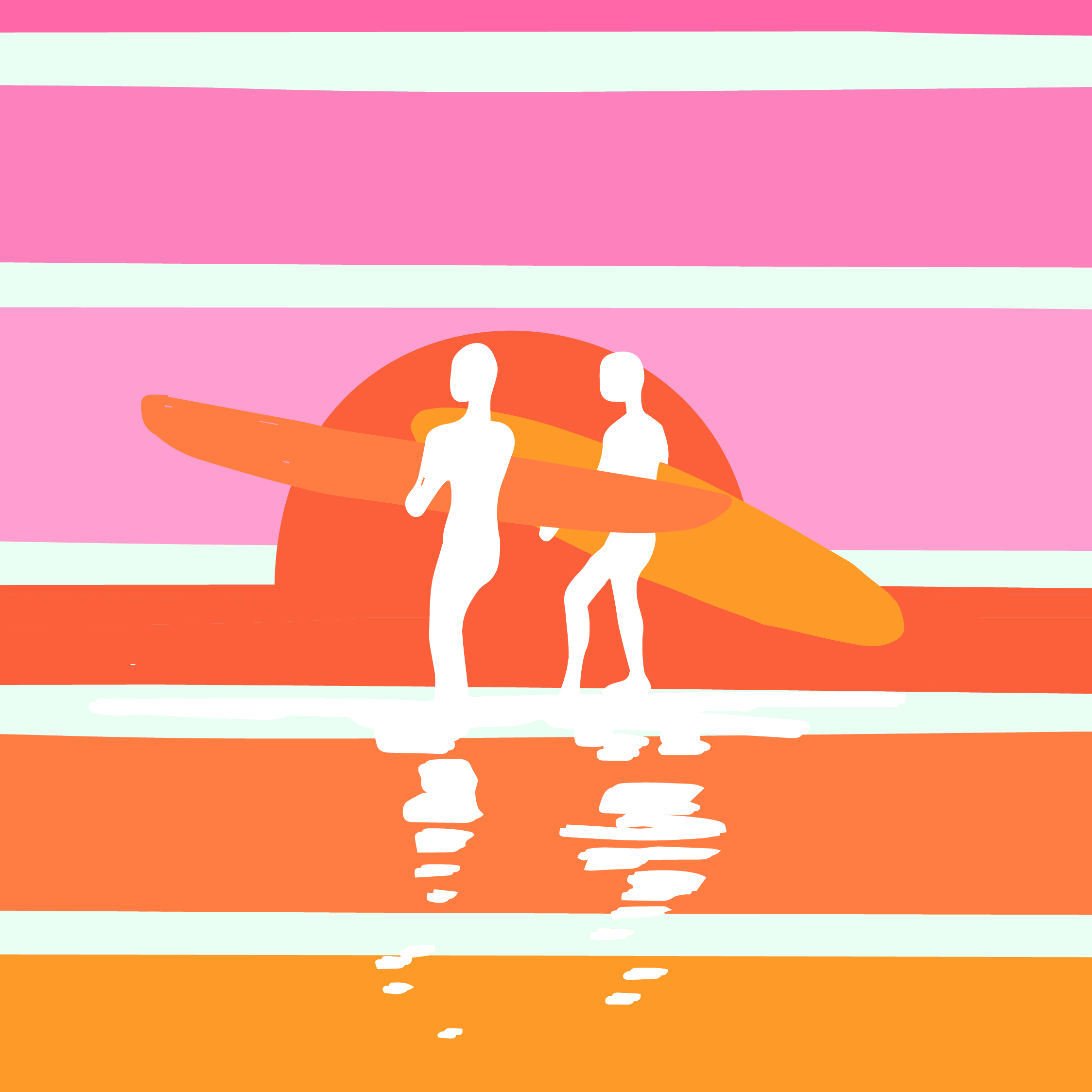
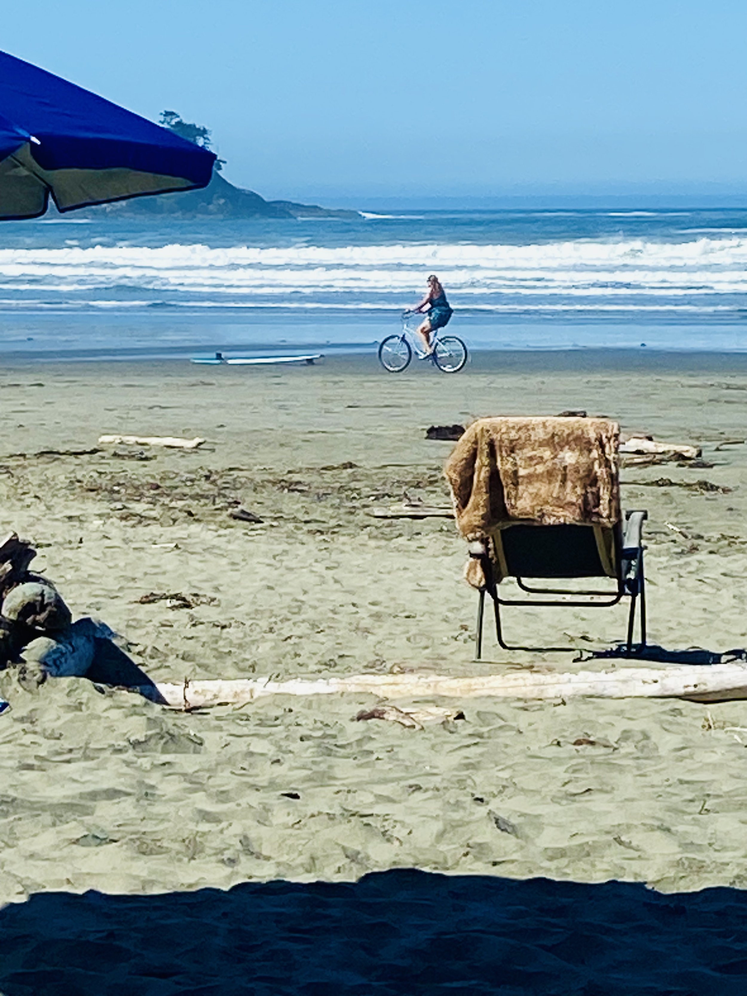
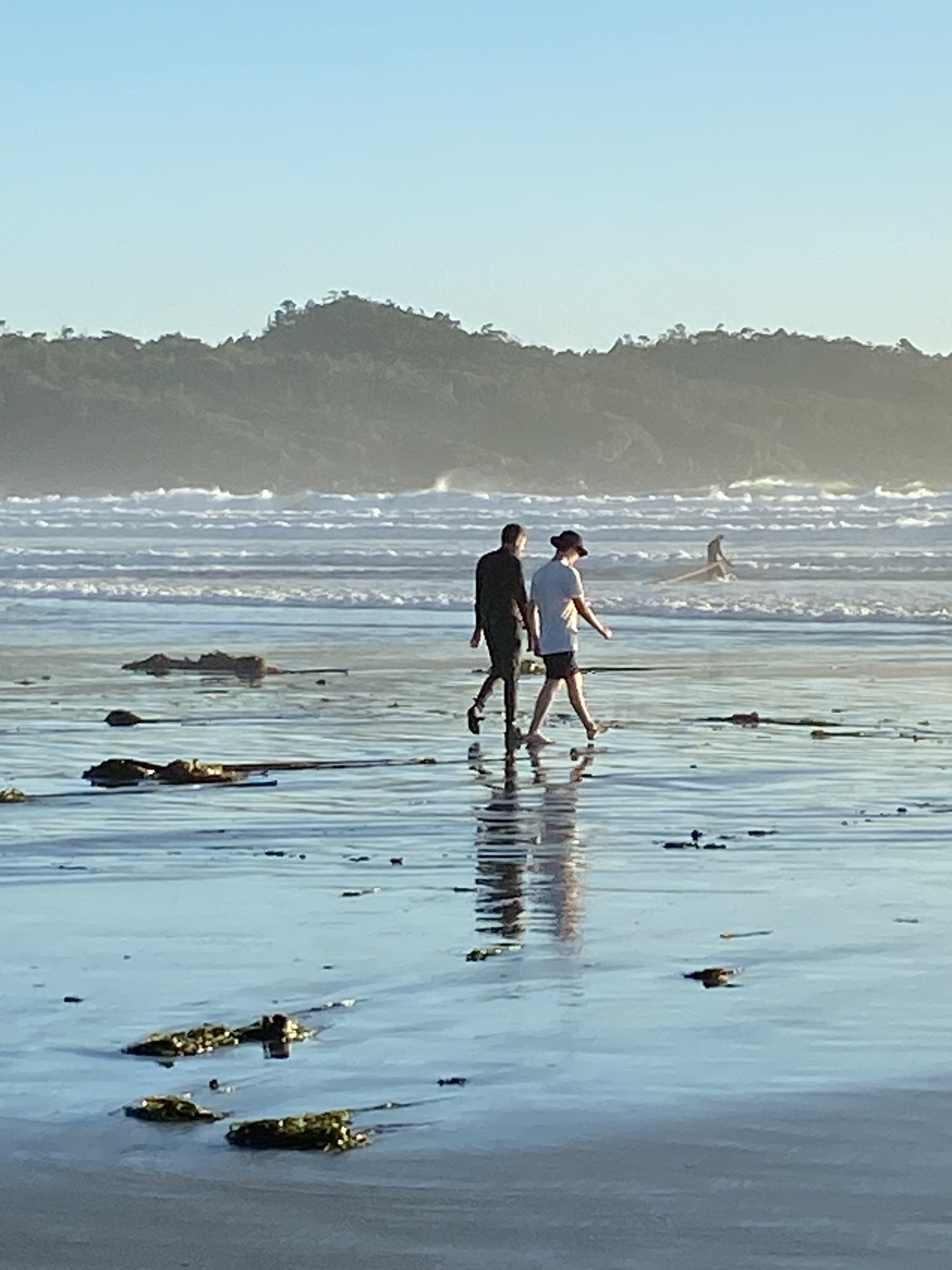
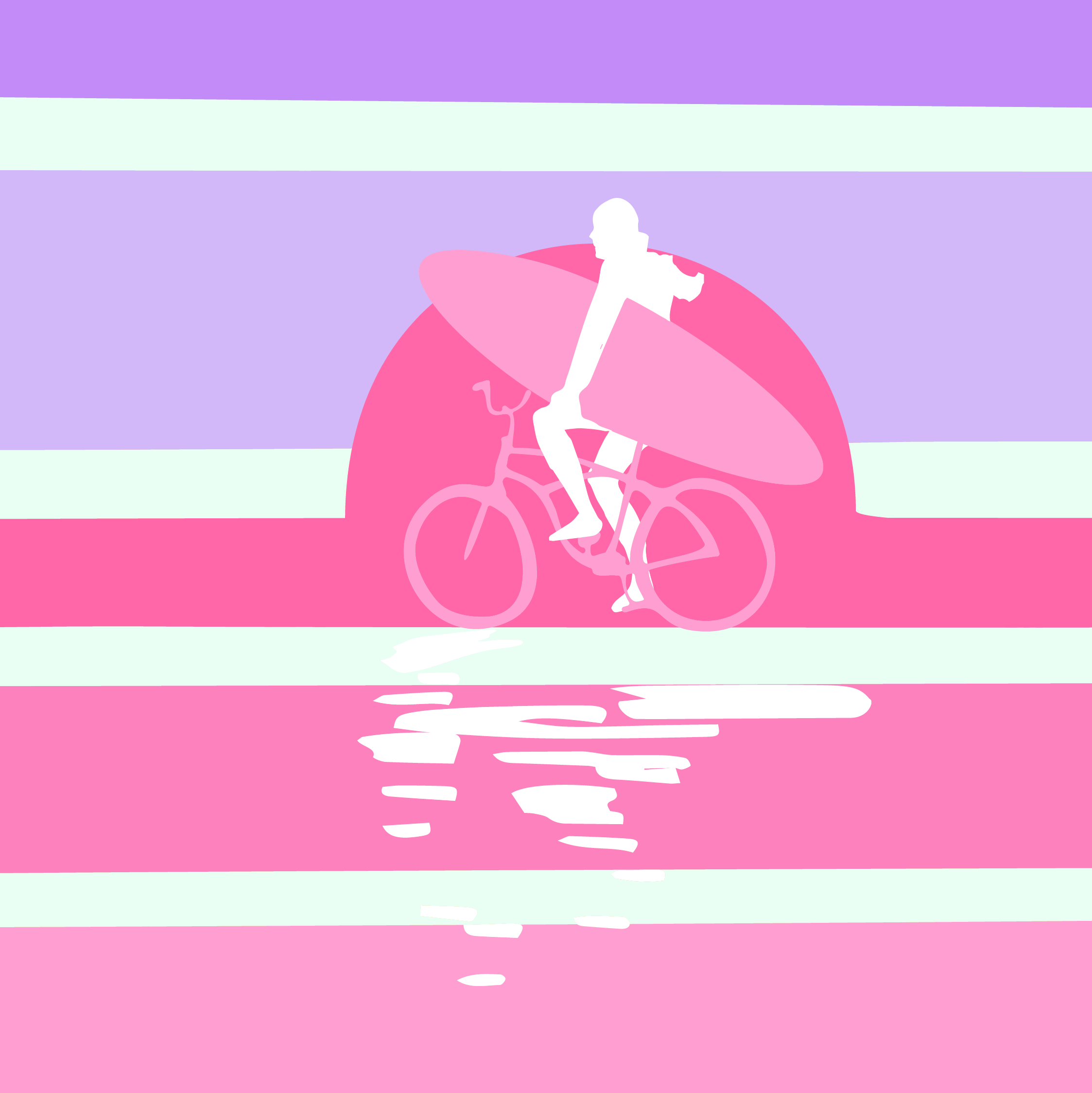
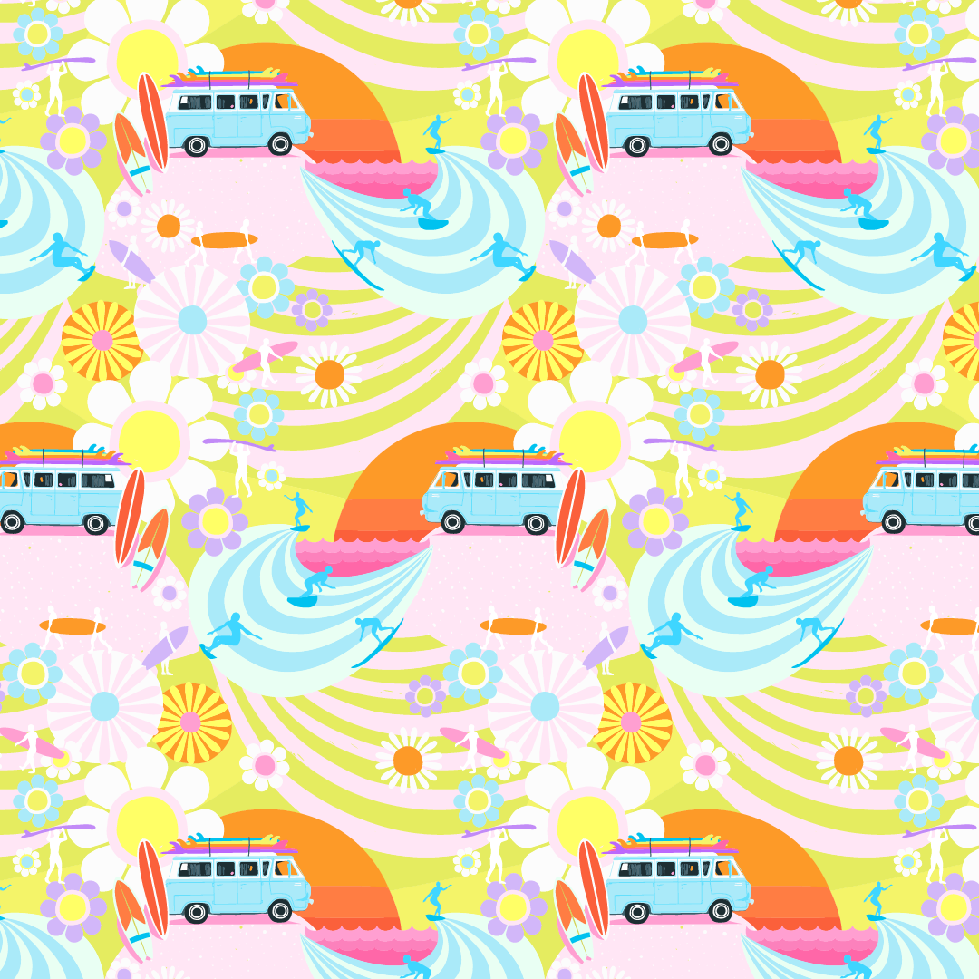
I haven’t even told you about the sunsets yet! They were blazing and reminded me of the Endless Summer movie poster, hence the name for the top left print.

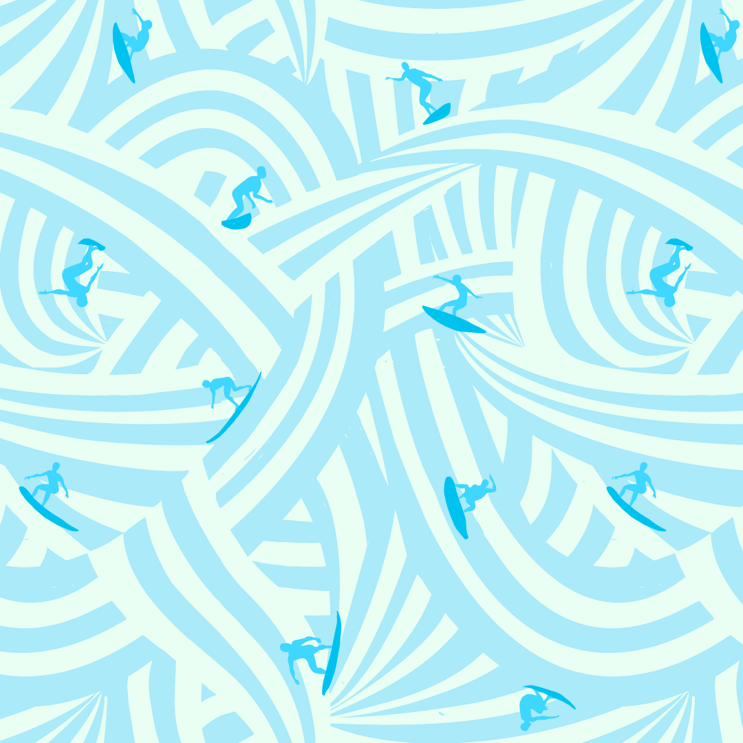
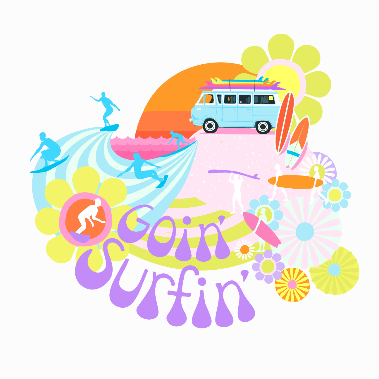
With every collection I love to do a standalone illustration for the name of the collection. While playing with some markers, I came up with the goin’ surfin’ lettering and ended up incorporating it into a tossed goin’ surfin’ van print.

So the moral of the story is, eat Tacofino, it’s good for your health, especially the diablo cookies, as is ice cream at Chocolate Tofino! Oh and yes, inspiration is everywhere… especially in Tofino!


PRETTY PLEASED ABOUT PURPLE!

… BEFORE IT USED TO MAKE ME PUKE! Okay well that’s a bit dramatic but it has been on my “No thank you” list for a long time. When I started designing for my Goin’ Surfin’ collection I wanted to push my colour palette and decided now was the time to make friends with purple. I had done it with grey about ten years ago, so I knew it was possible. Have you ever had a colour aversion?

I think A LOT about colour and I’m curious about these aversions. I don’t know what it’s like for you but for me colour is instinctual. I’ve taken all the colour theory courses, but to be honest, I can never remember all the rules. All I know is when I use certain colours or combinations they give me strong feelings that I react to.

I know about the symbolism of colour, which I find surprisingly conflicting for some colours (like yellow which can be both happy and anxious). I know purple is a hard colour to make and that’s why it was reserved for royalty, but that never helped me warm up to it.

Then there’s a psychology to colour but I think it gets muddy with your personal relationship to it. Let’s say a colour was a hot trend when you were a kid, for example avocado green, and you have memories of your mom making you peanut butter and jelly sandwiches as you basked in your avocado green kitchen. You might have warm fuzzy feelings whenever you see avocado green but others might have the exact opposite reaction to it.

When it comes down to it, I think the specific hue is the important factor to making friends with a colour. For example, my father in law and I both love yellow. Except, he loves school bus yellow and I love a bright lemon yellow. To me, it’s not the same colour at all! Kind of like growing up with other Lisa’s in my class room. I didn’t think of our names as the same ever, even though they sounded the same!

So in the end, I searched and found a hue of purple I adored and used in Goin’ Surfin’. Not only did I stretch my colour palette, I finally made friends with purple and I LOVE what it did for this collection, especially my Sunshine Floral! Those pops of purple really made it sing!


MAKING WAVES FOR SURFERS!

Designing the waves of this intricate surfer print was one of my favourite design challenges in this Goin’ Surfin’ fabric collection!

Once I got my head wrapped around the repeat, and realized I needed to bring each wave to a point (otherwise it looked like toothpaste, ha, ha!) AND then when I put the surfer silhouettes on the waves, it was pure joy!

Then of course I played with ALL the colours (my very favourite thing to do!)! While I didn’t end up using the pink and yellow waves for the surfers I did end using it for the base of the sunshine floral!

In the end we went with the above colourways. ALL of them I’d LOVE to swim in! Or Surf! :D


SUNSET (STRIPE)

Just a heads up: if I’m working on a collection, you might end up in it!

…Sometimes collections come out of unexpected places. Last summer I’d been working on a new collection when an opportunity to go camping with some friends in Tofino popped up. We’re hotel-ers not campers, but we went for it anyways. Little did I know, taking this break would become a breakthrough for my collection too!

Tofino had these amazing sunsets on its beaches, and with these beaches came surfers, walkers, dog walkers, bikers and sometimes surfer bikers (he’s my favorite!)… which is how this SUNSET (STRIPE) print came to be!


DESIGNER FEATURE : : LOVE PATCHWORK & QUILTING #121

Love Patchwork & Quilting has always been one of my very favorite magazines. They reached out to me for the first time in 2018 and inquired about doing a feature on me and my sewing designs. I had no idea I was even on their radar! In fact, at that exact time I was finishing up a quilt pattern to submit to them (that was the We Got the Beat pattern). Since then I’ve written 5 sewing patterns for them, plus that first feature issue (not including various "OUT THERE" fabric collection features). I was super excited when Sadina Nowshin contacted me about a fabric designer feature! In Issue 121 we chatted about my design process and comfort zones!

Thank you to Love Patchwork & Quilting for being such huge supporters of my work, love ya right back!