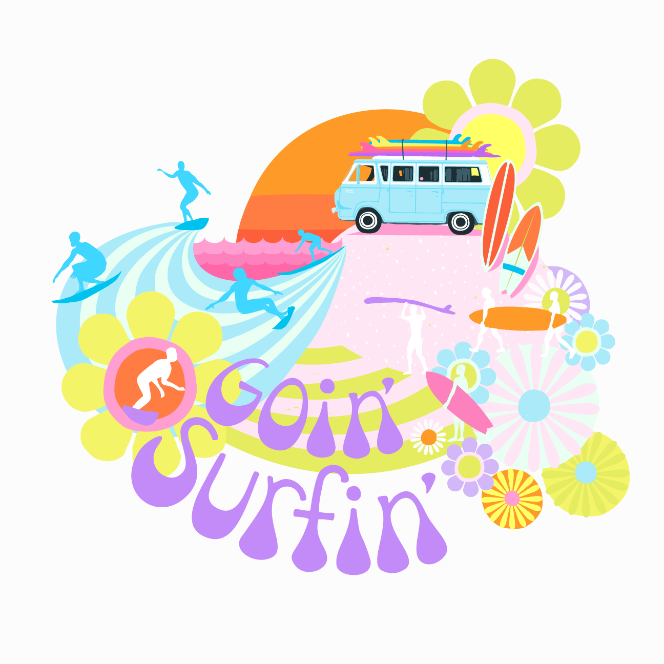
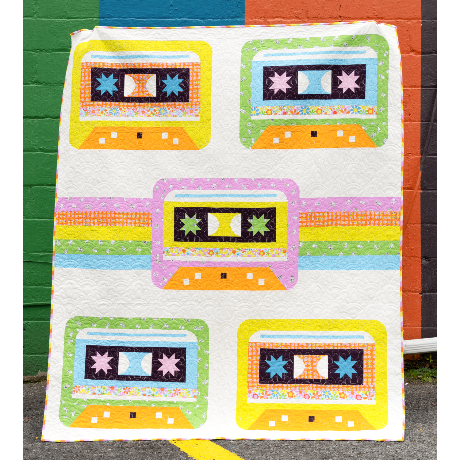
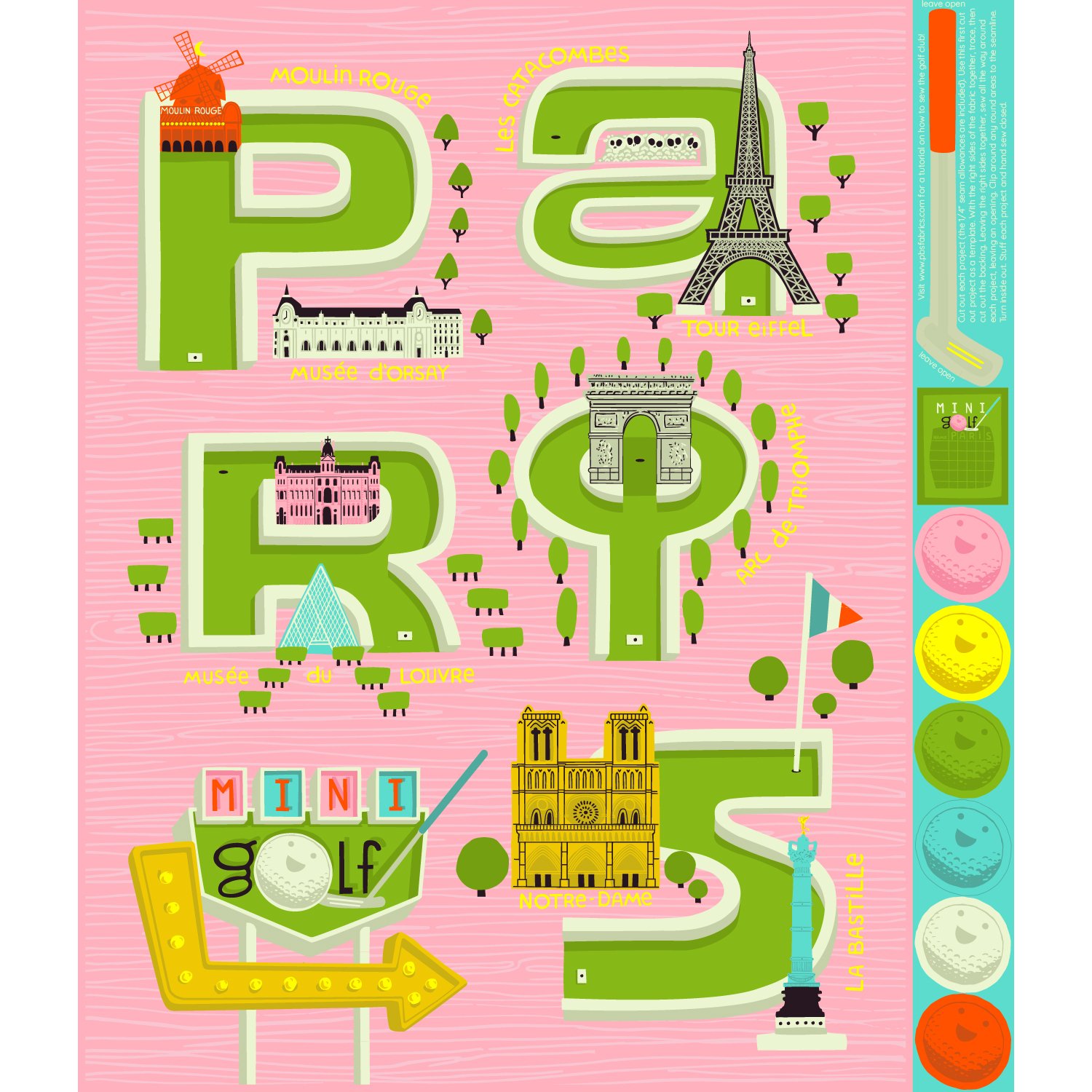
I have always loved mini golf! I also fell in love with Paris when we were there in 2016. Then, fast forward to 2020 when I was taking Stacie Boomfield’s Leverage Your Art course, we were given an assignment to do a map. I used that assignment as a jumping off point and created the first version of the illustration you see in the panel of this new collection. This past May, I reworked it and it became the backbone of my Le Mini Golf fabric collection for Paintbrush Studio Fabrics!
Here are few fun facts that inspired each print:
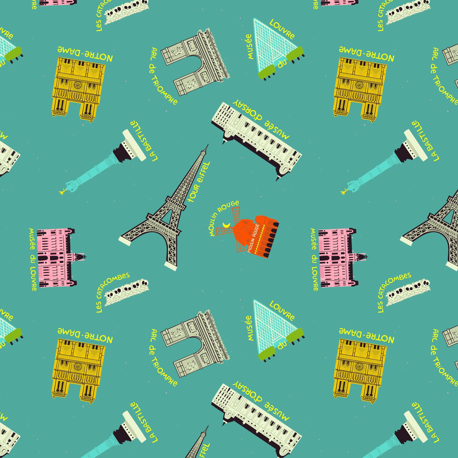
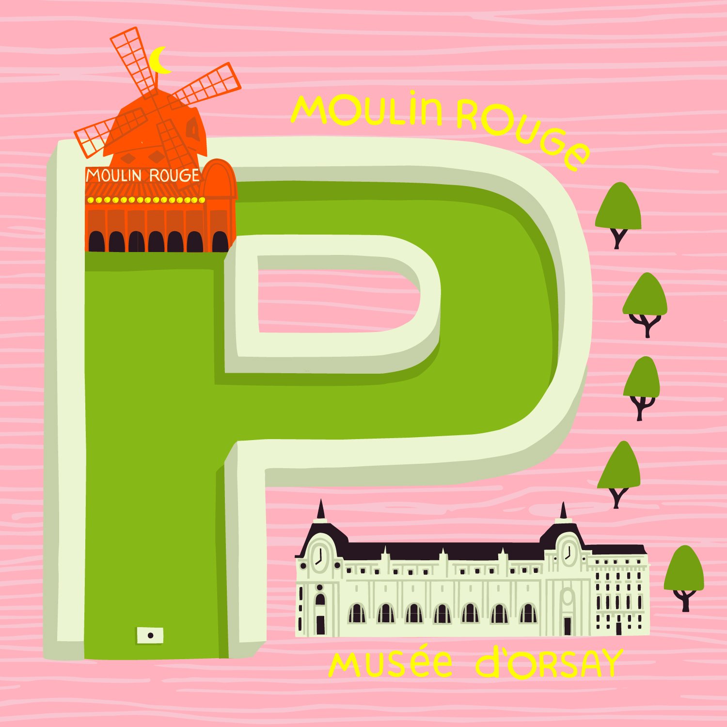
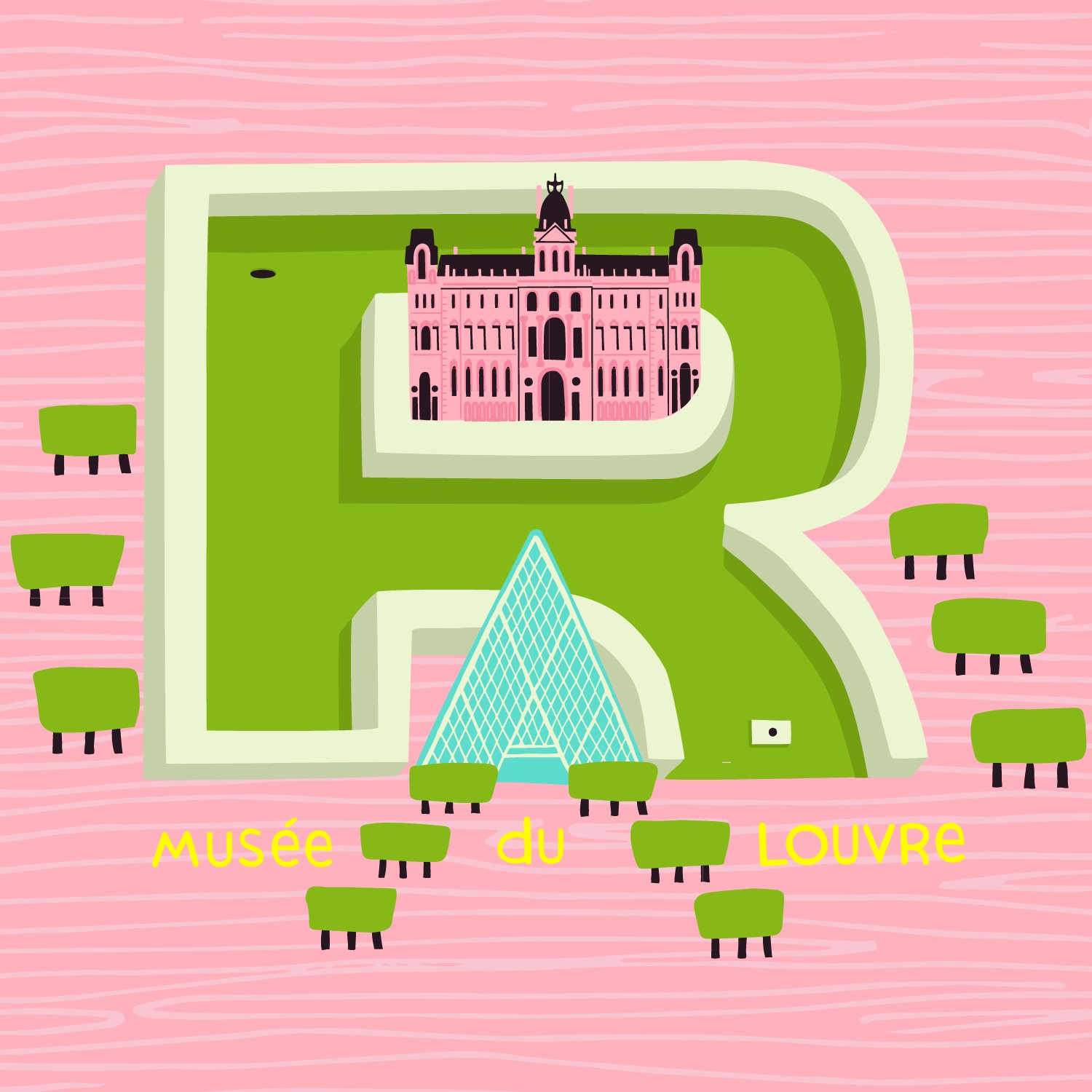
MONUMENTS: When I was in Paris my mom and I did a speed run through the Musee d'Orsay. We had 45 minutes before it closed. It was the first time I had ever seen an actual Monet! His colours are to die for!
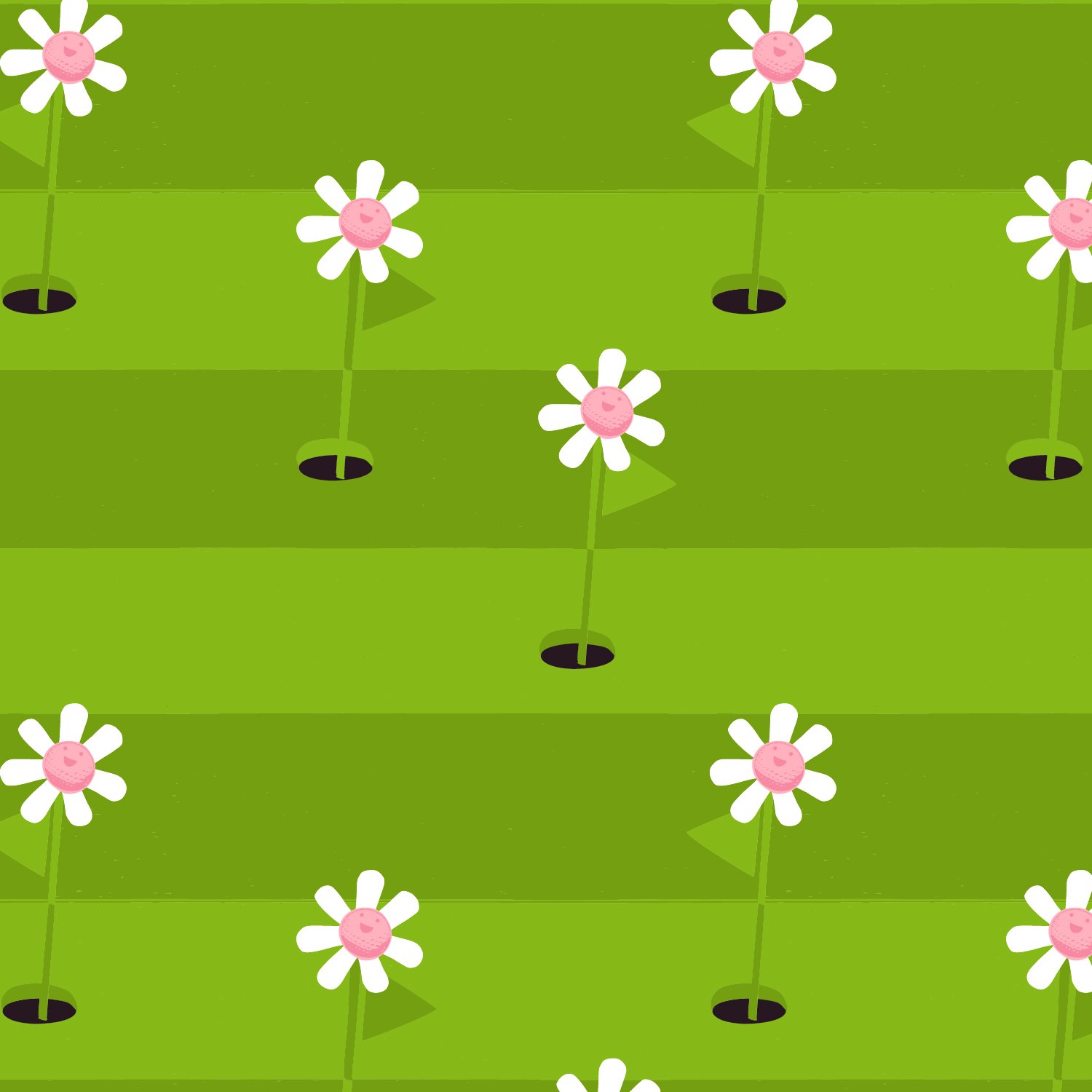
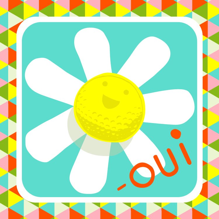
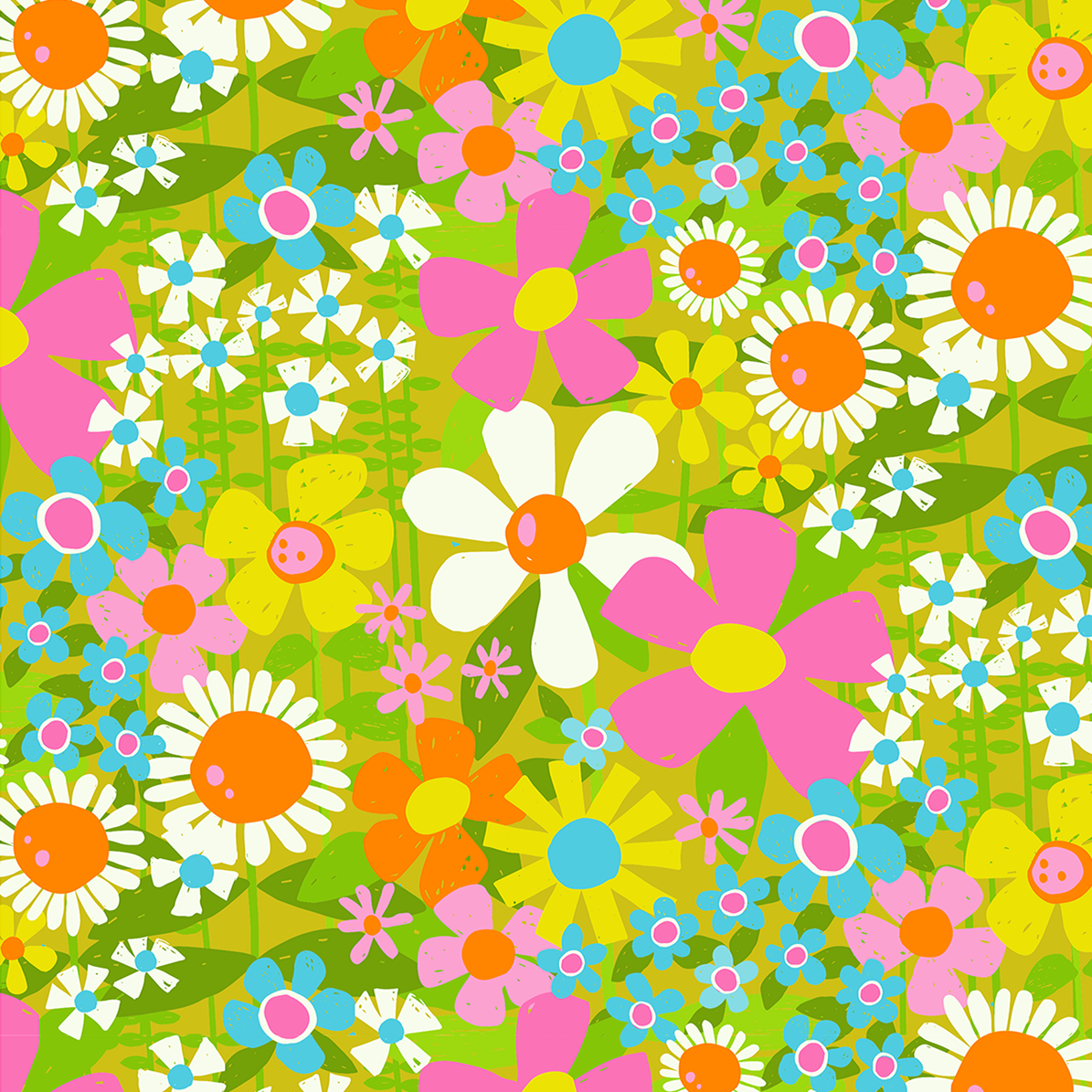
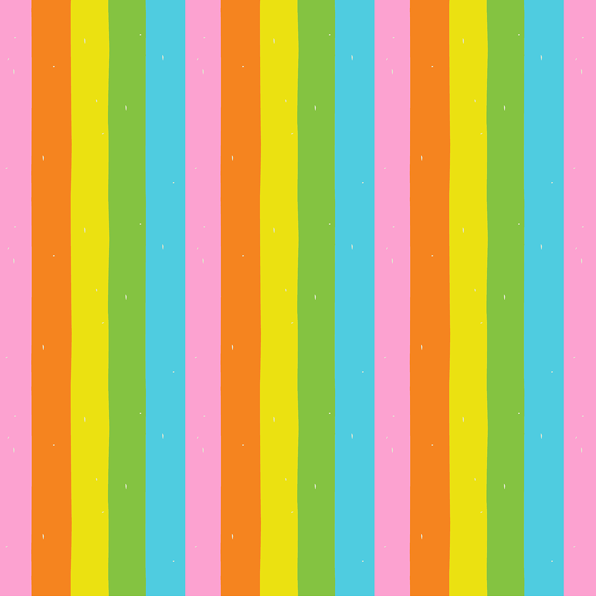
FLOWERS-PLAY DAY: In high school we’d take the bus to the big city (an hour away) just to play mini-golf! * This print also comes in RAYON! it’s so dreamy soft!
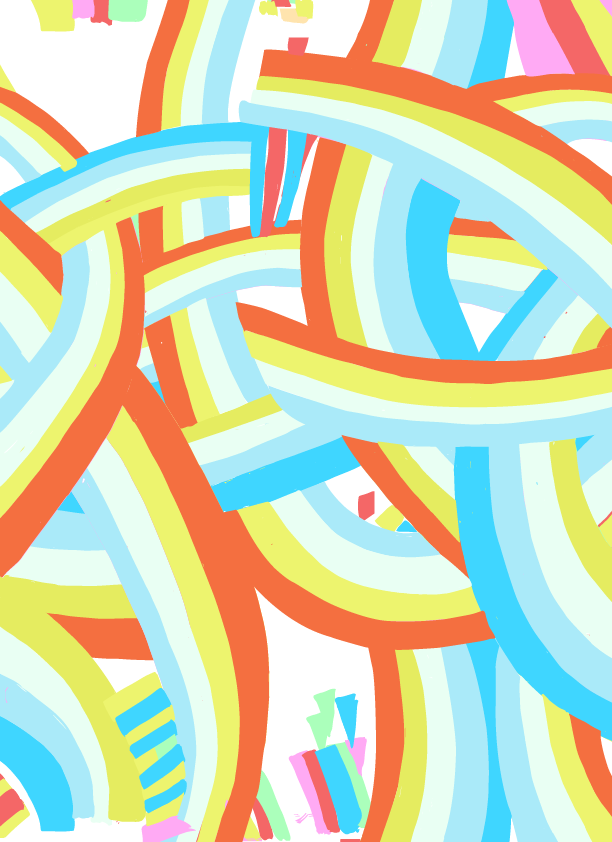
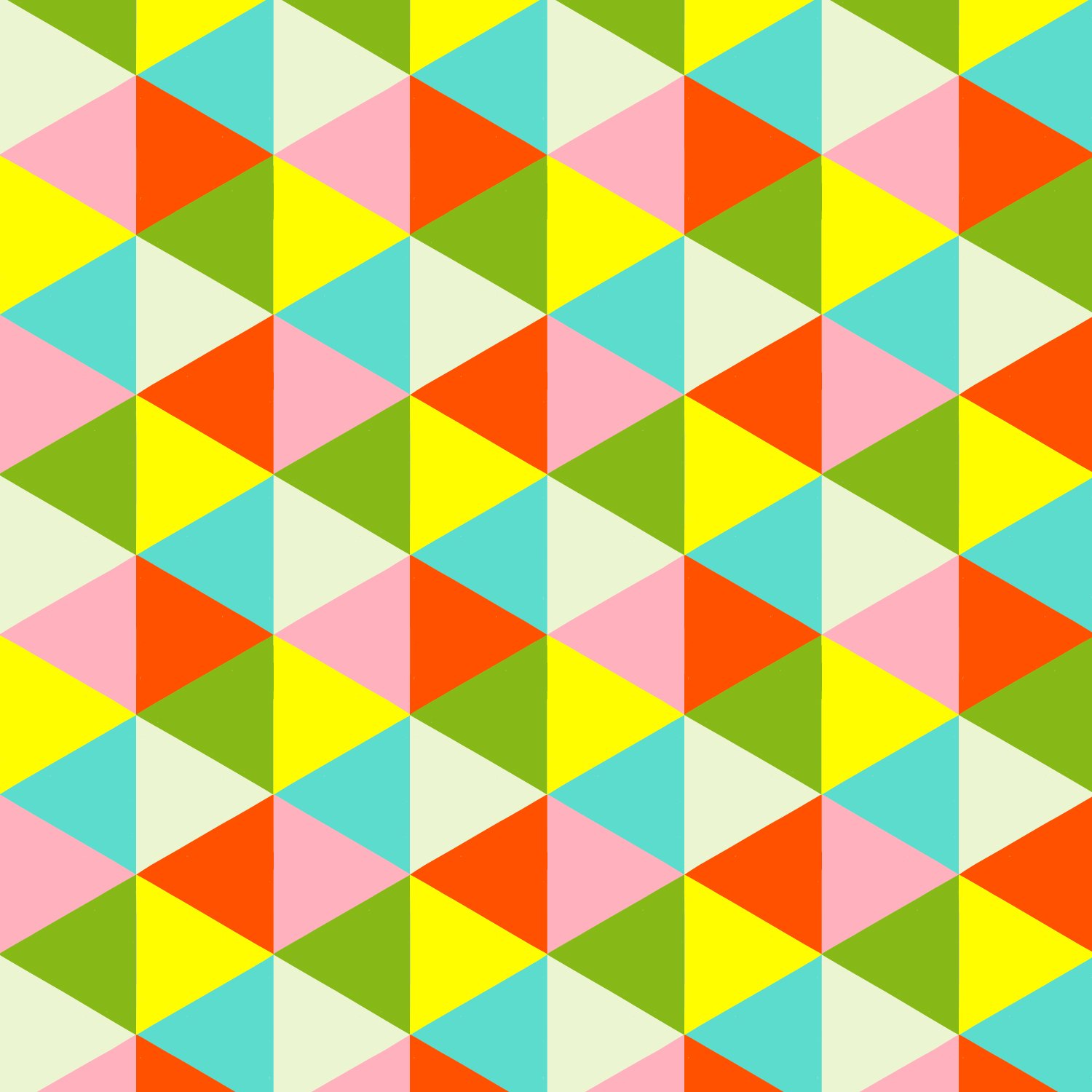
FLAGS: Well I love geometrics, triangles and colours. I only wish real mini golf had flags you had to take out of the holes!
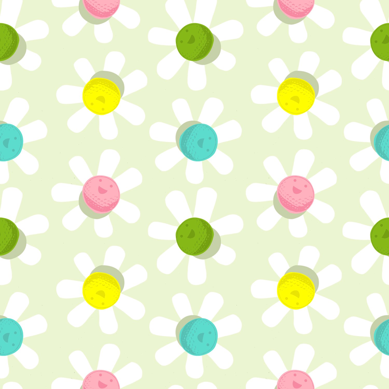
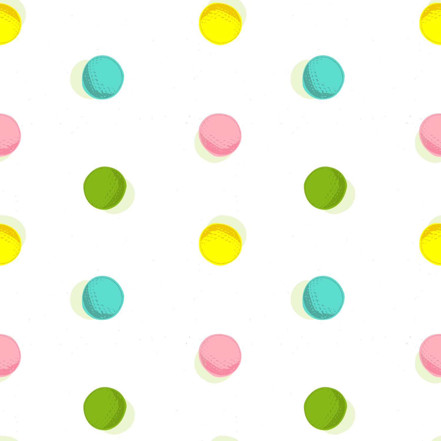
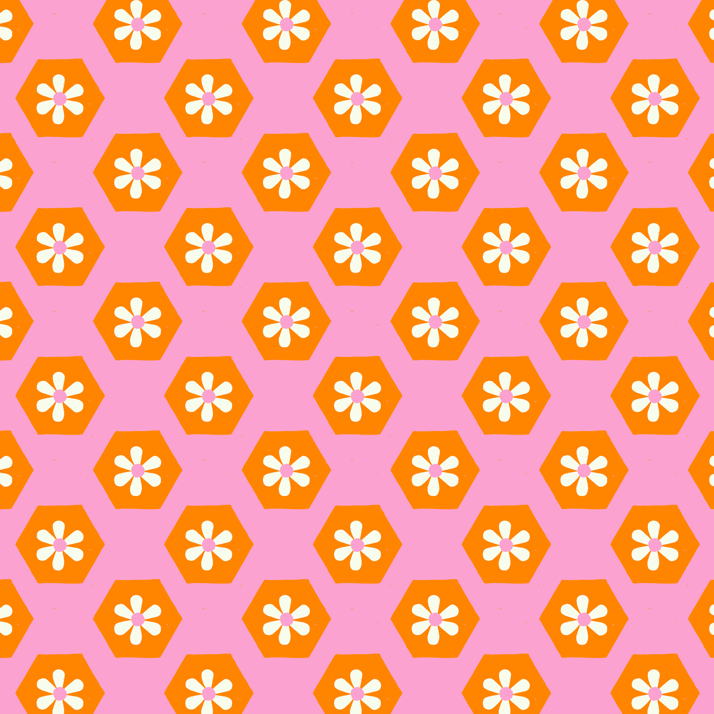
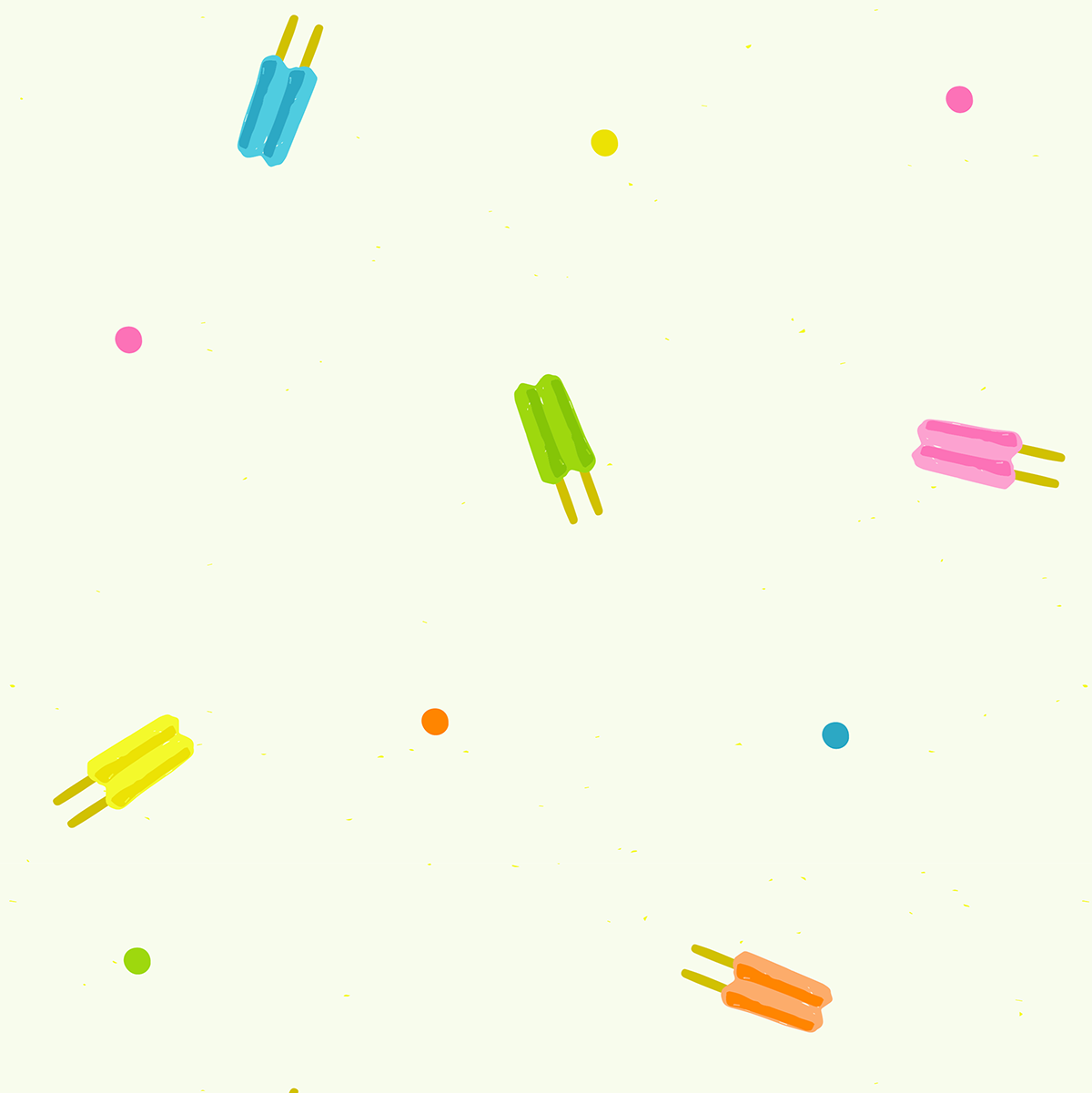
POLKA DOT-GOLF BALLS: When I submitted this collection to PBS Fabrics and they accepted it, they requested this print with larger golf balls, which I loved the idea of!
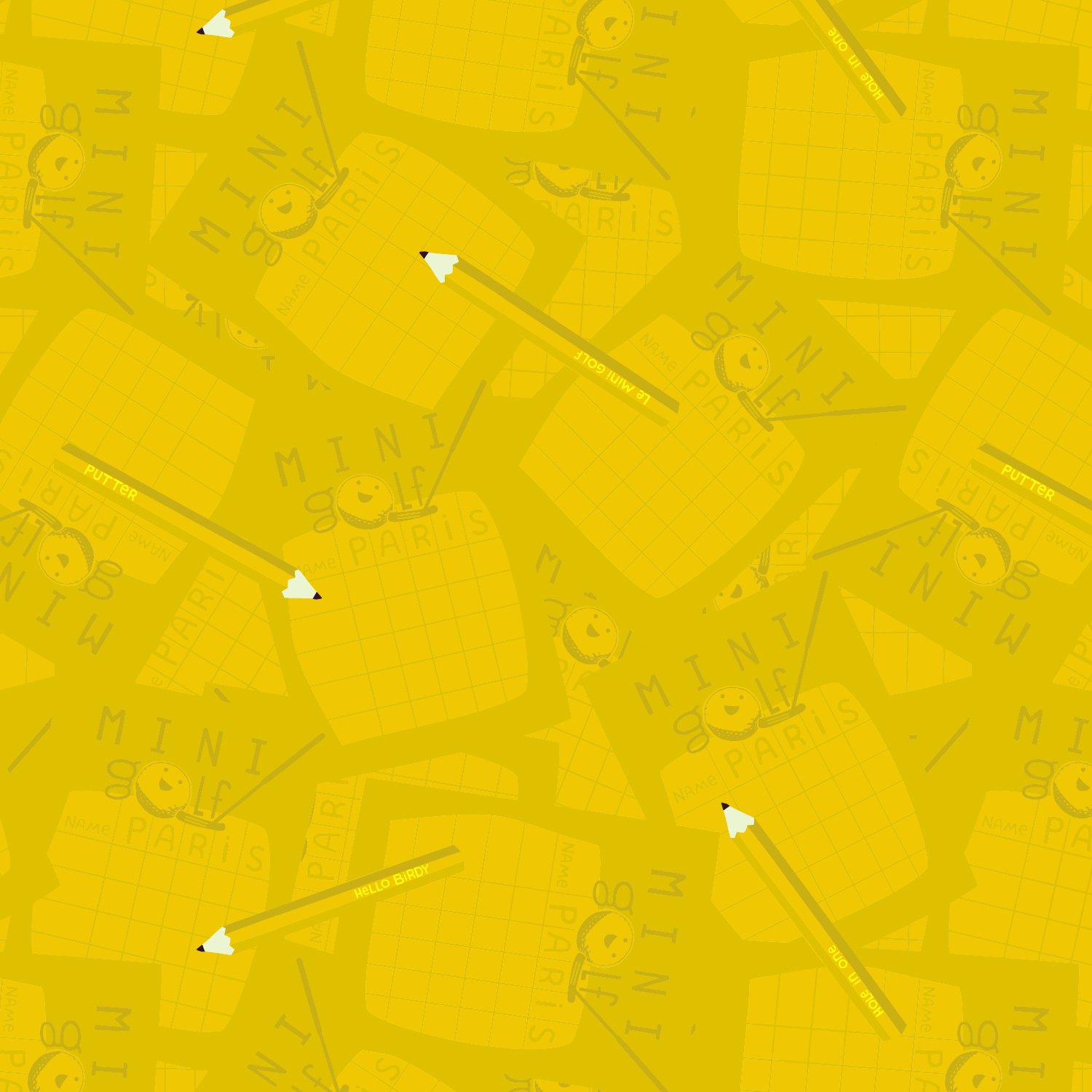
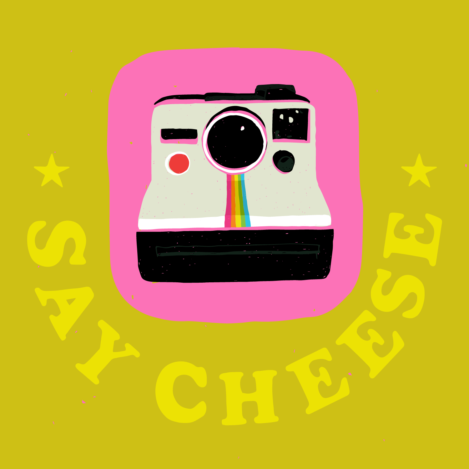
SCORE CARDS: Truth be told, I don’t keep score when I play (I find it more fun that way) but I do LOVE the little pencils!
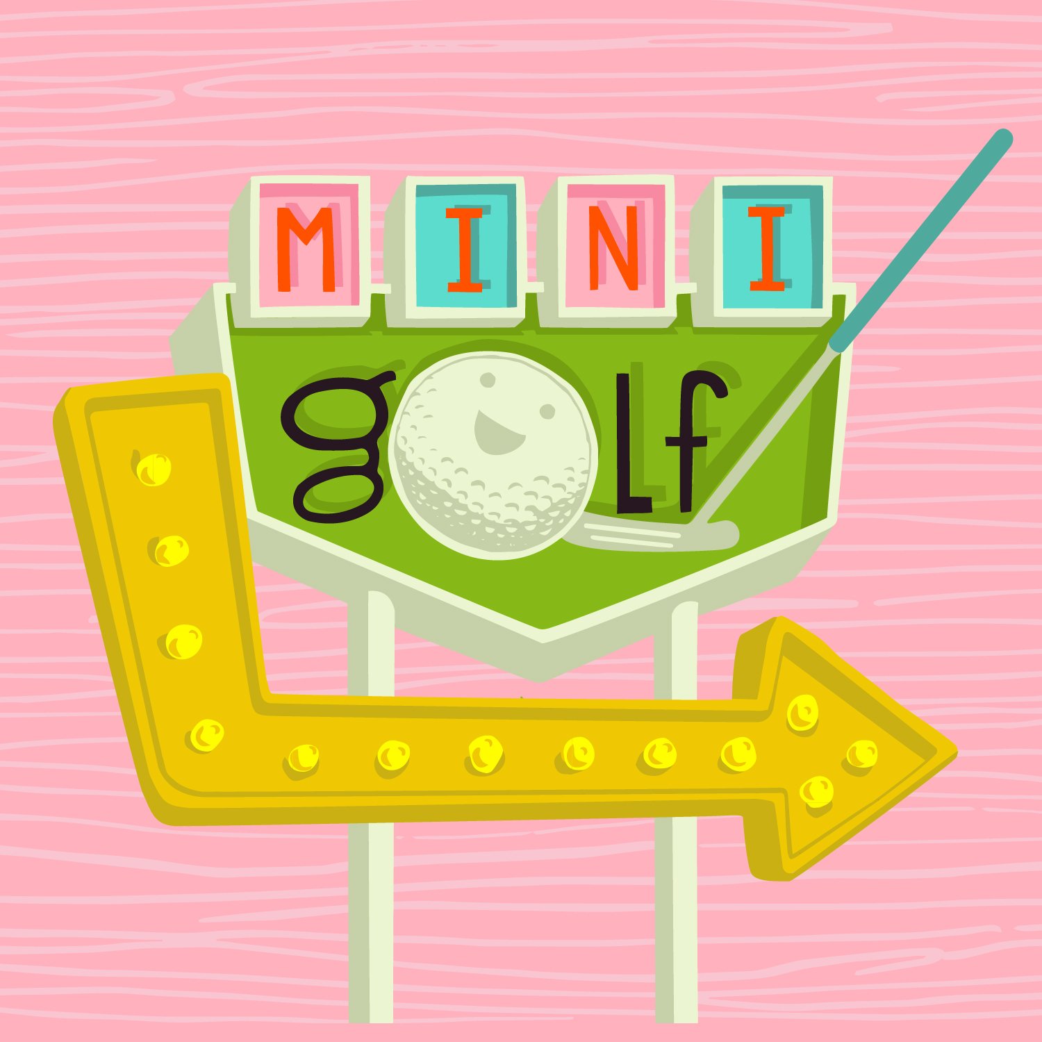
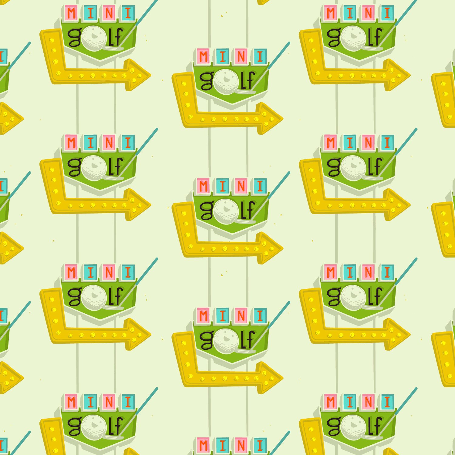
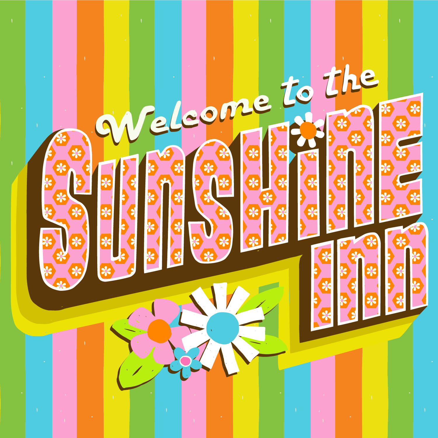
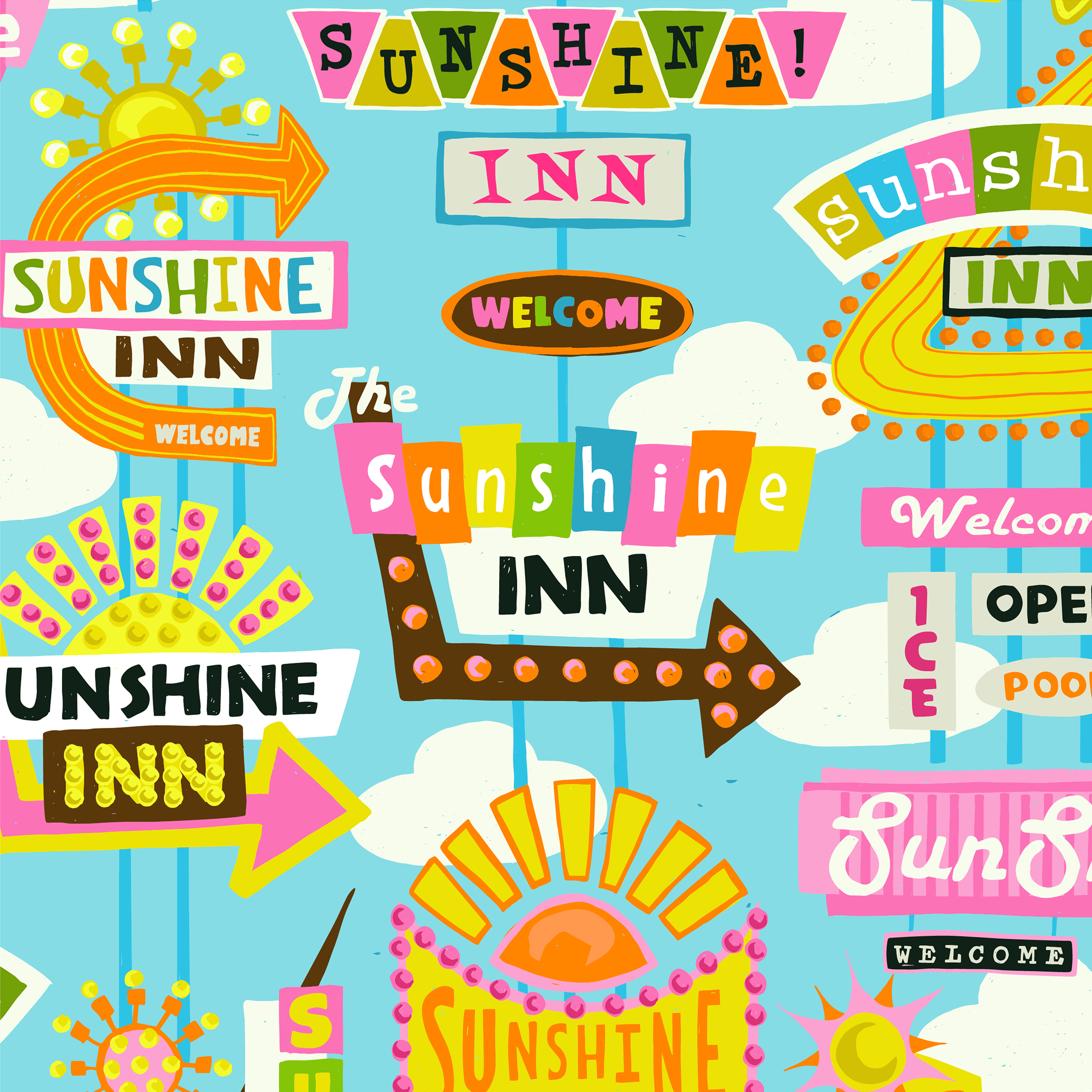
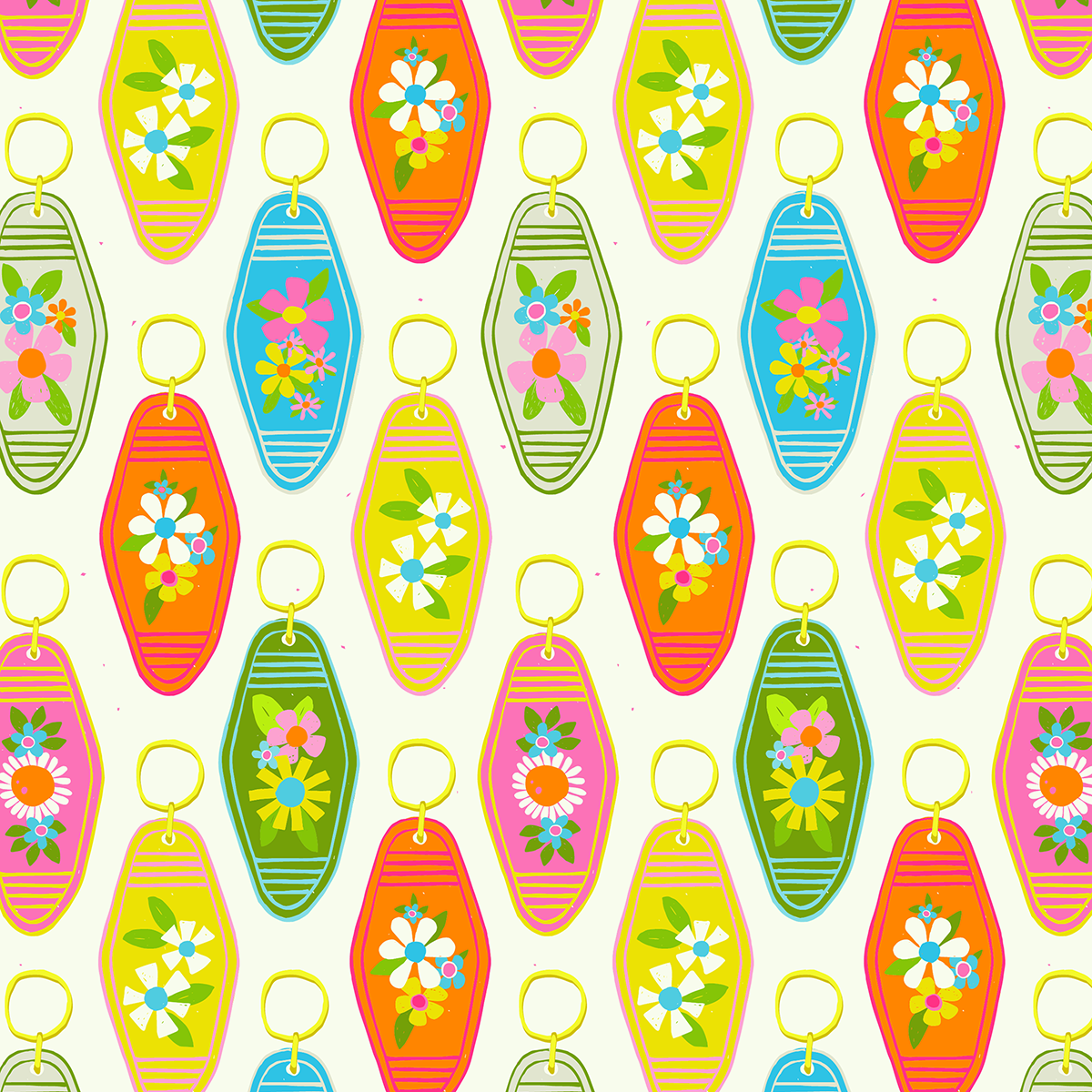
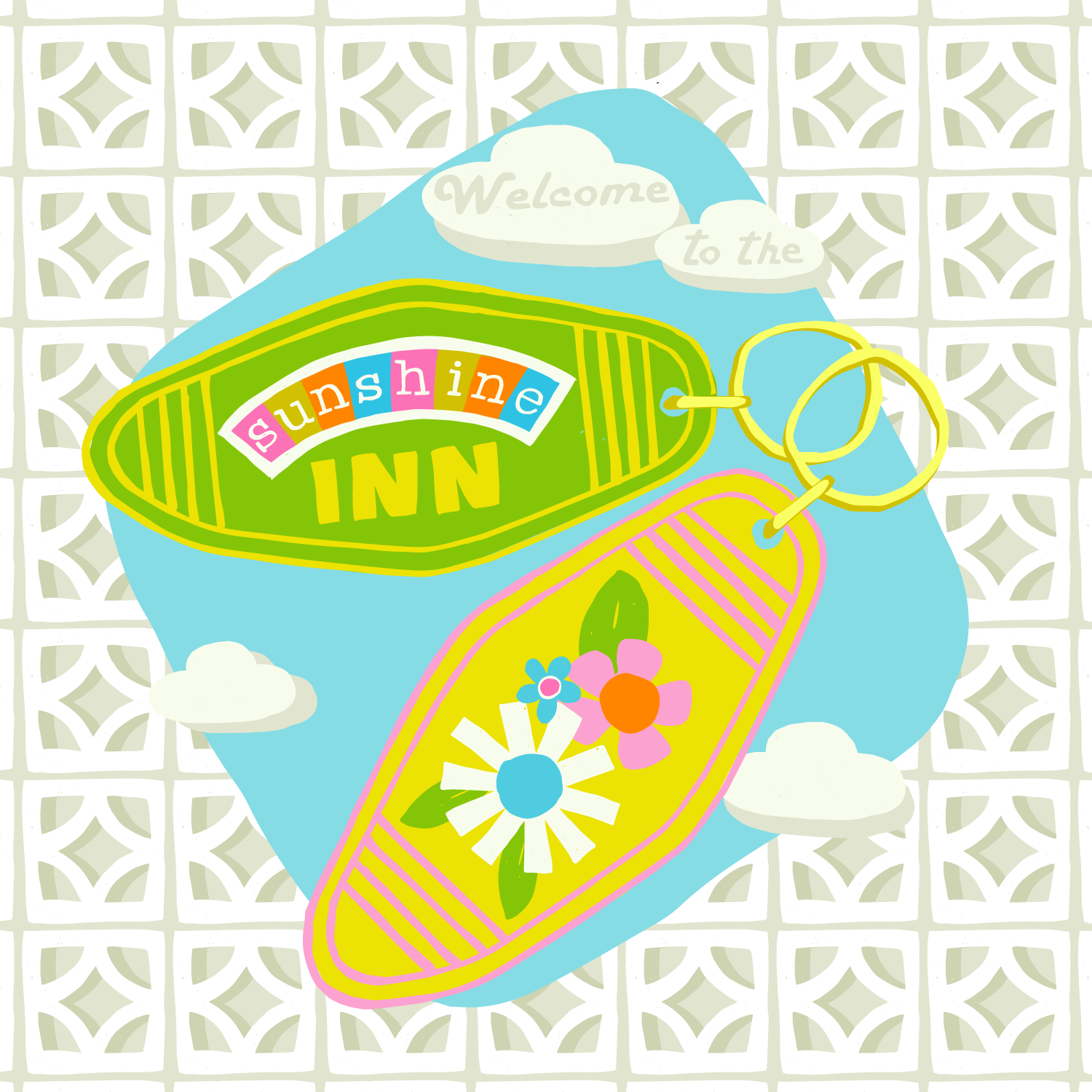
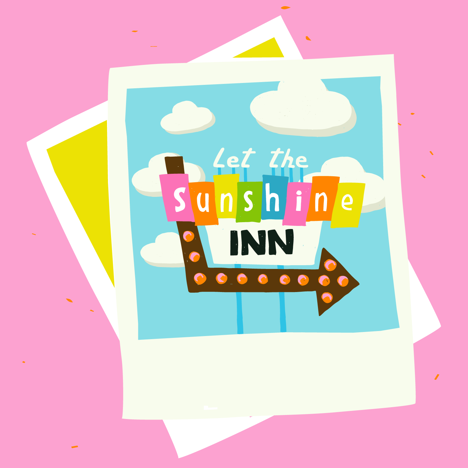
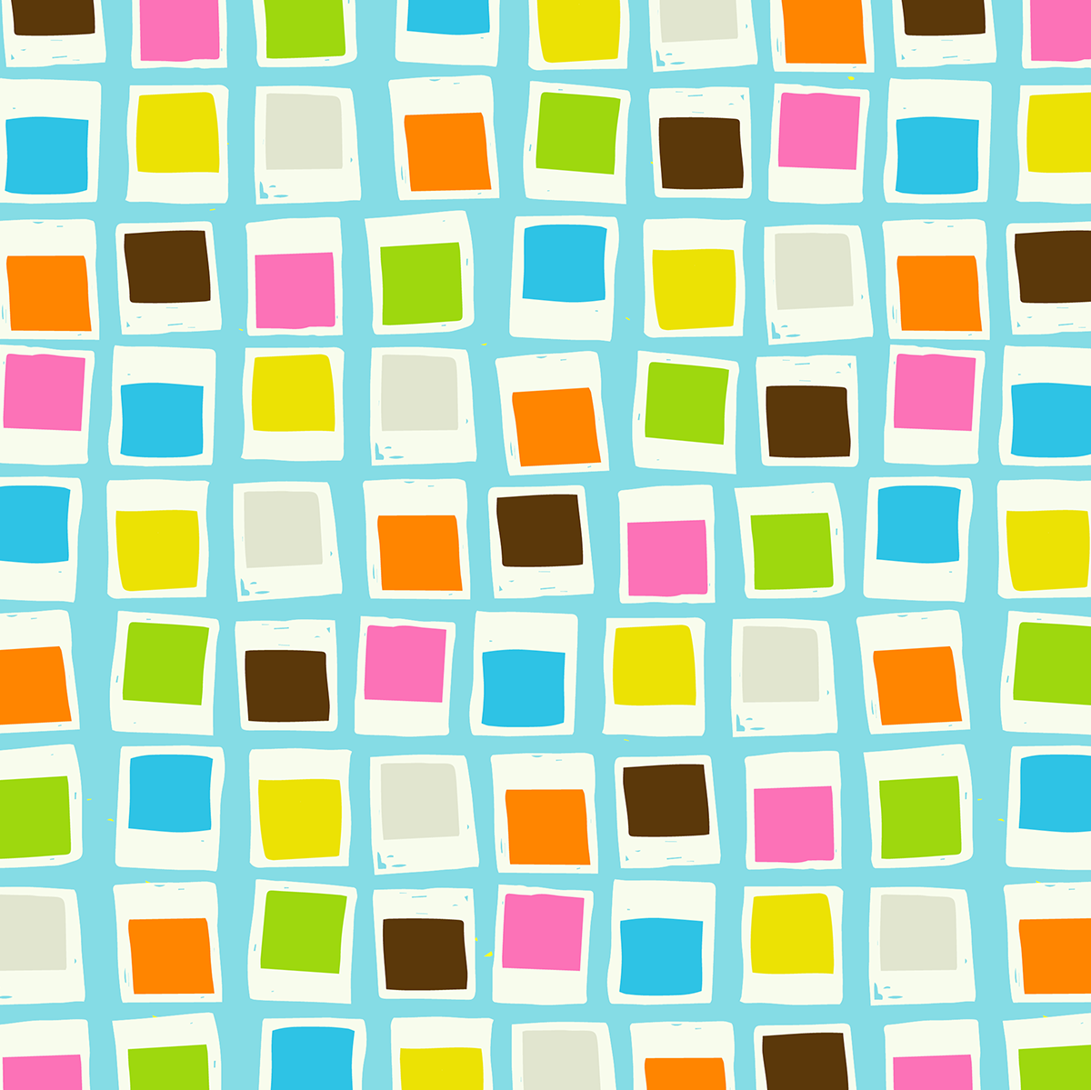
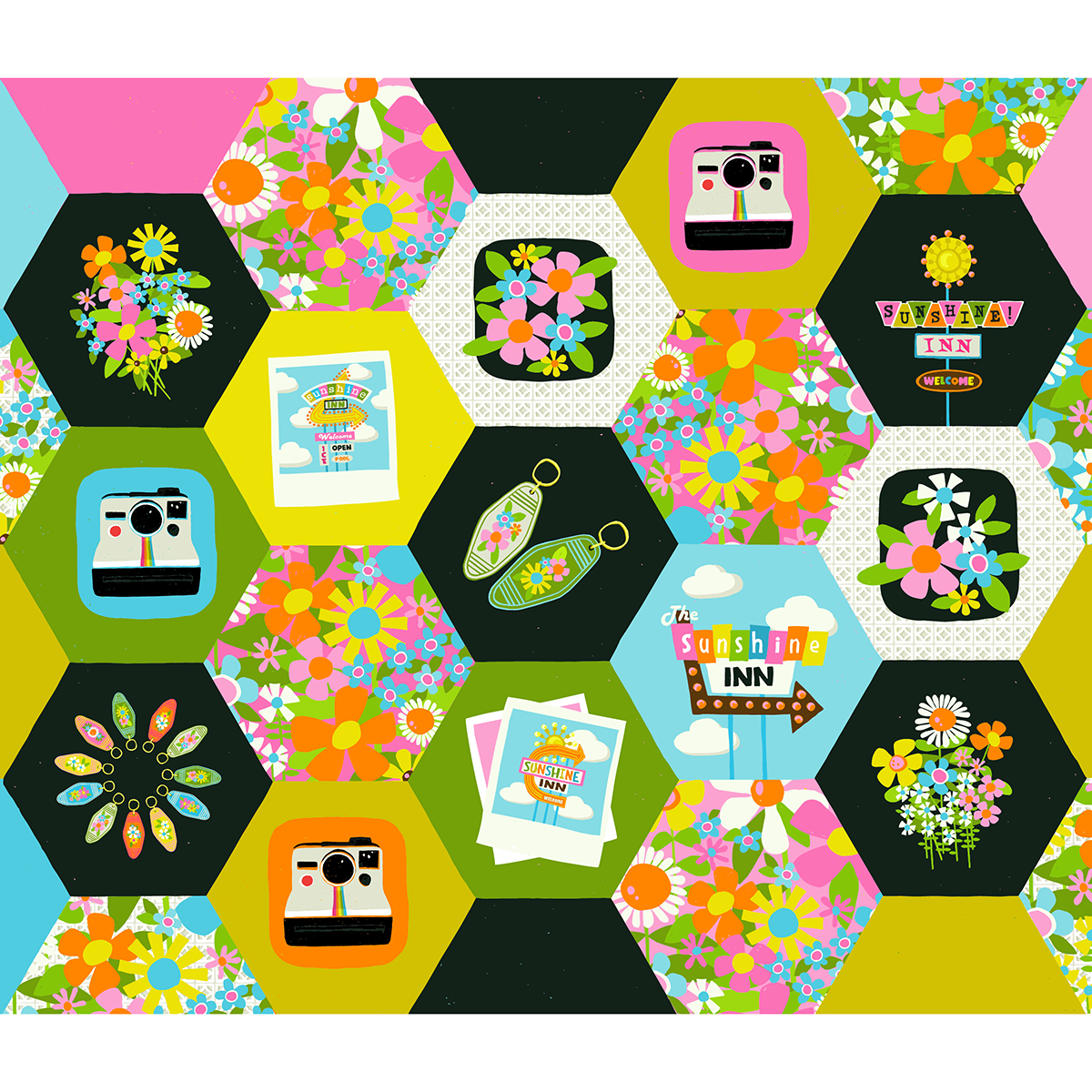
Le MINI GOLF SIGNS: This is the print that inspired the Sunshine Inn signs!
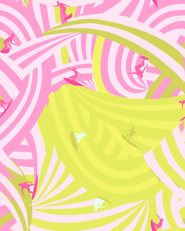
HOLE IN ONE: I love pink and green together AND I love BIG stripes! I can imagine these flowers popping out of each hole like whack-a-mole!
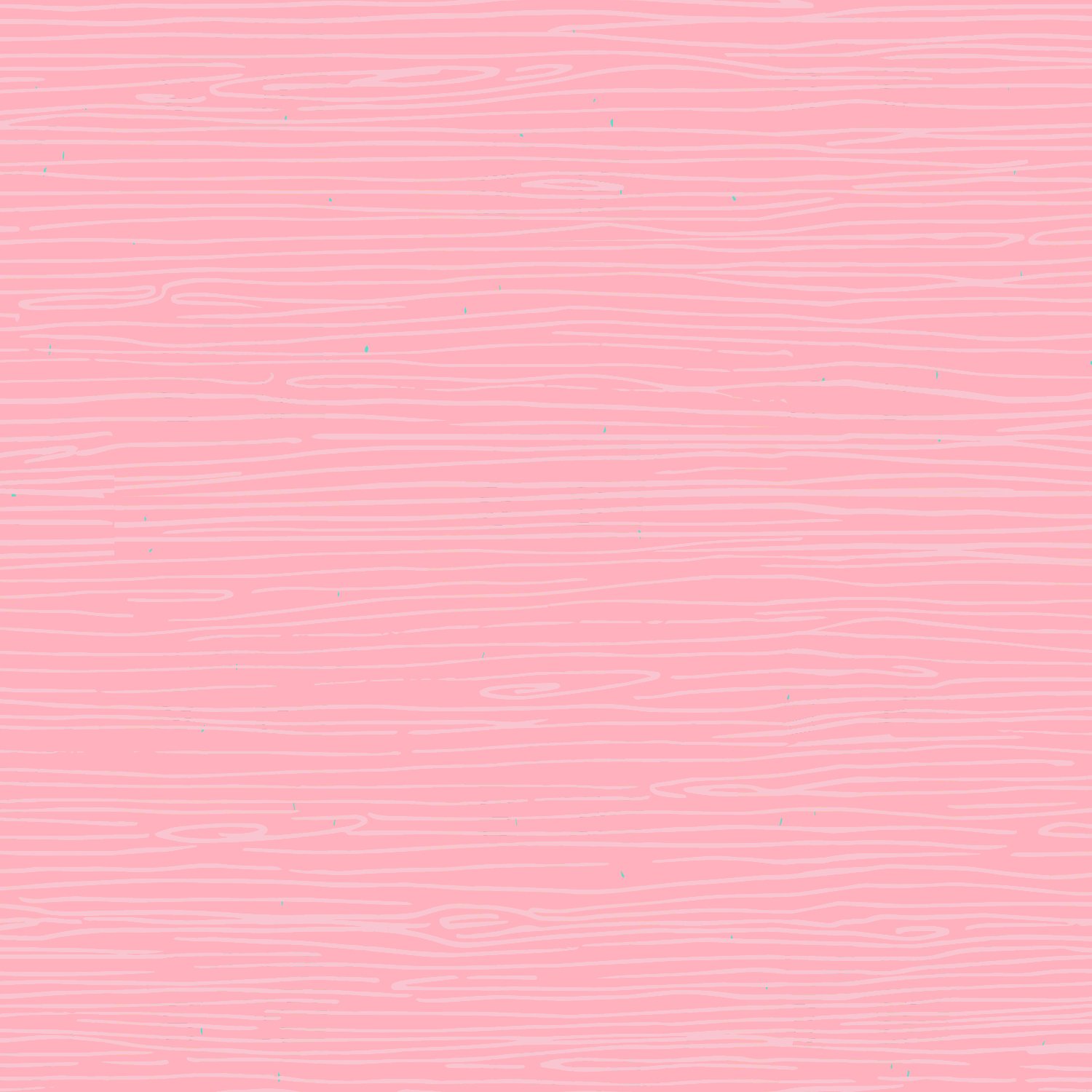
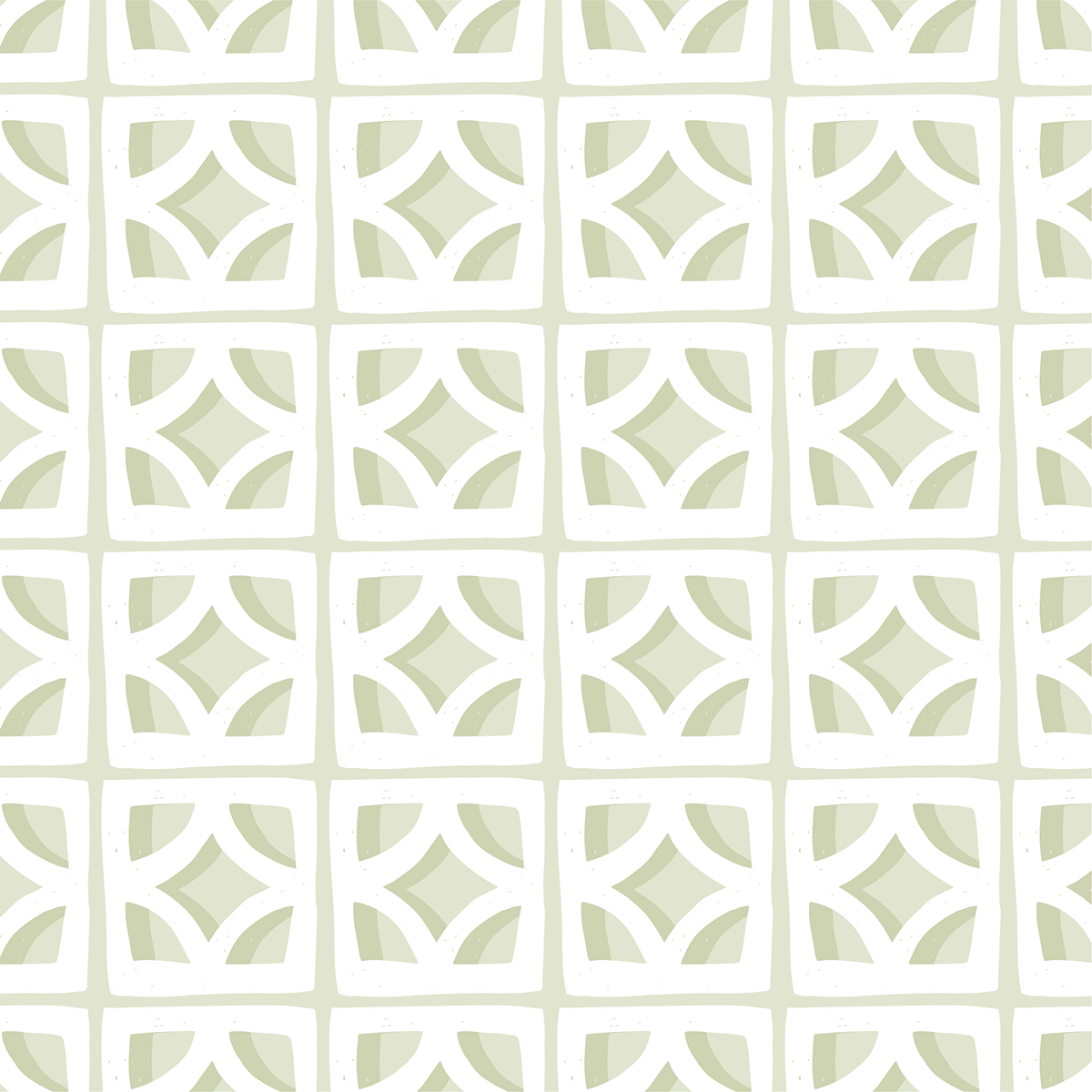
WOOD-TEXTURE: This is the texture behind the panel repeated… because who doesn’t love a snazzy tone on tone?!
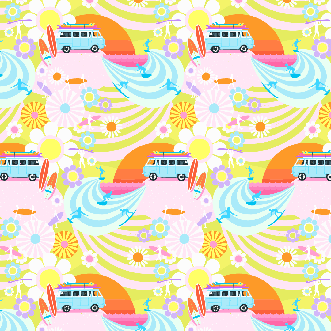
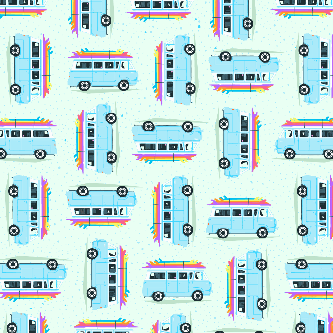
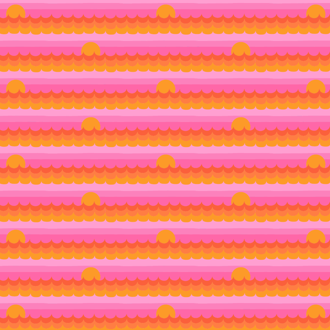
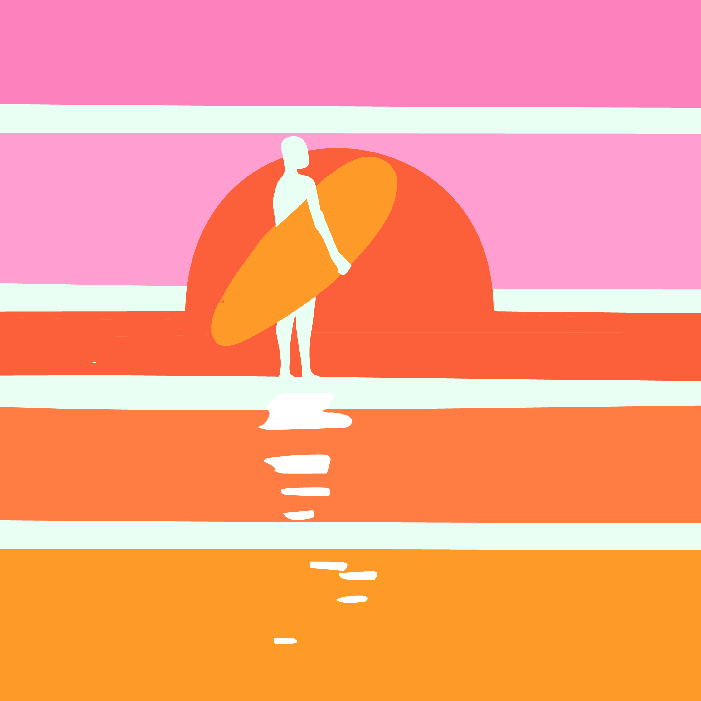
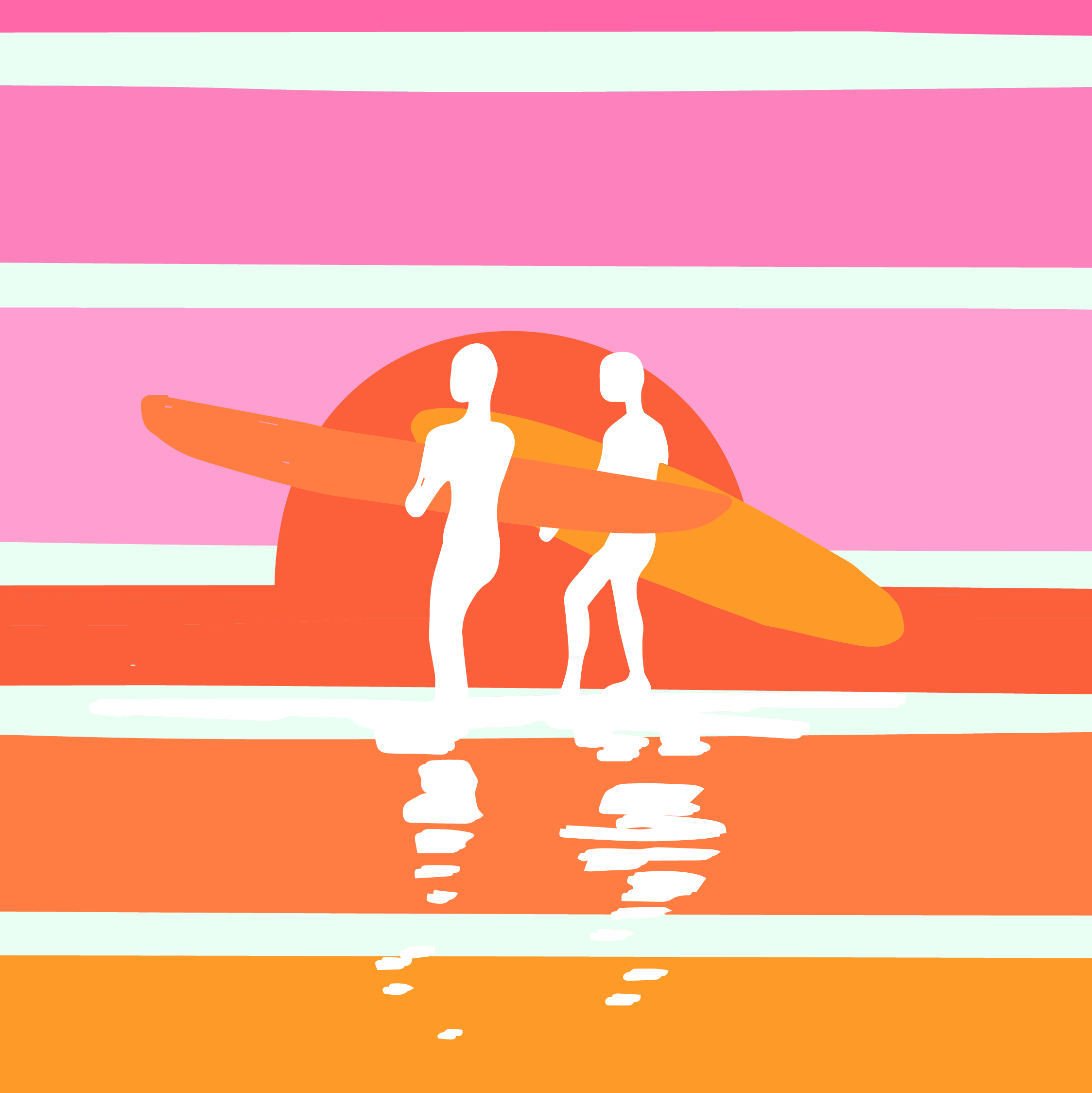
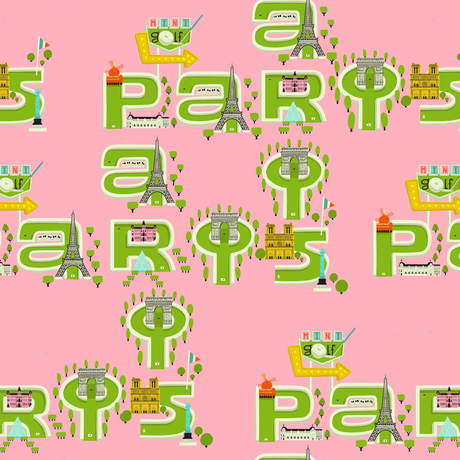
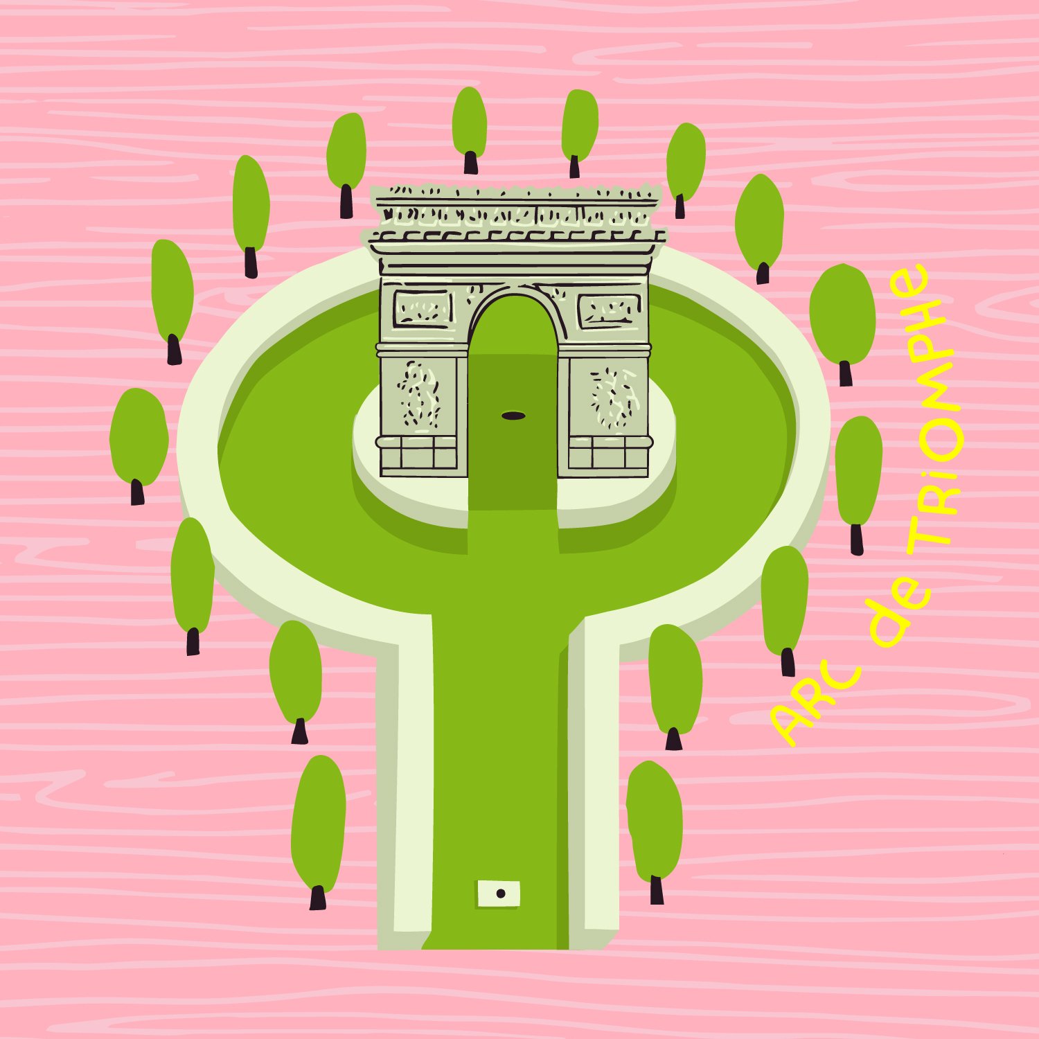
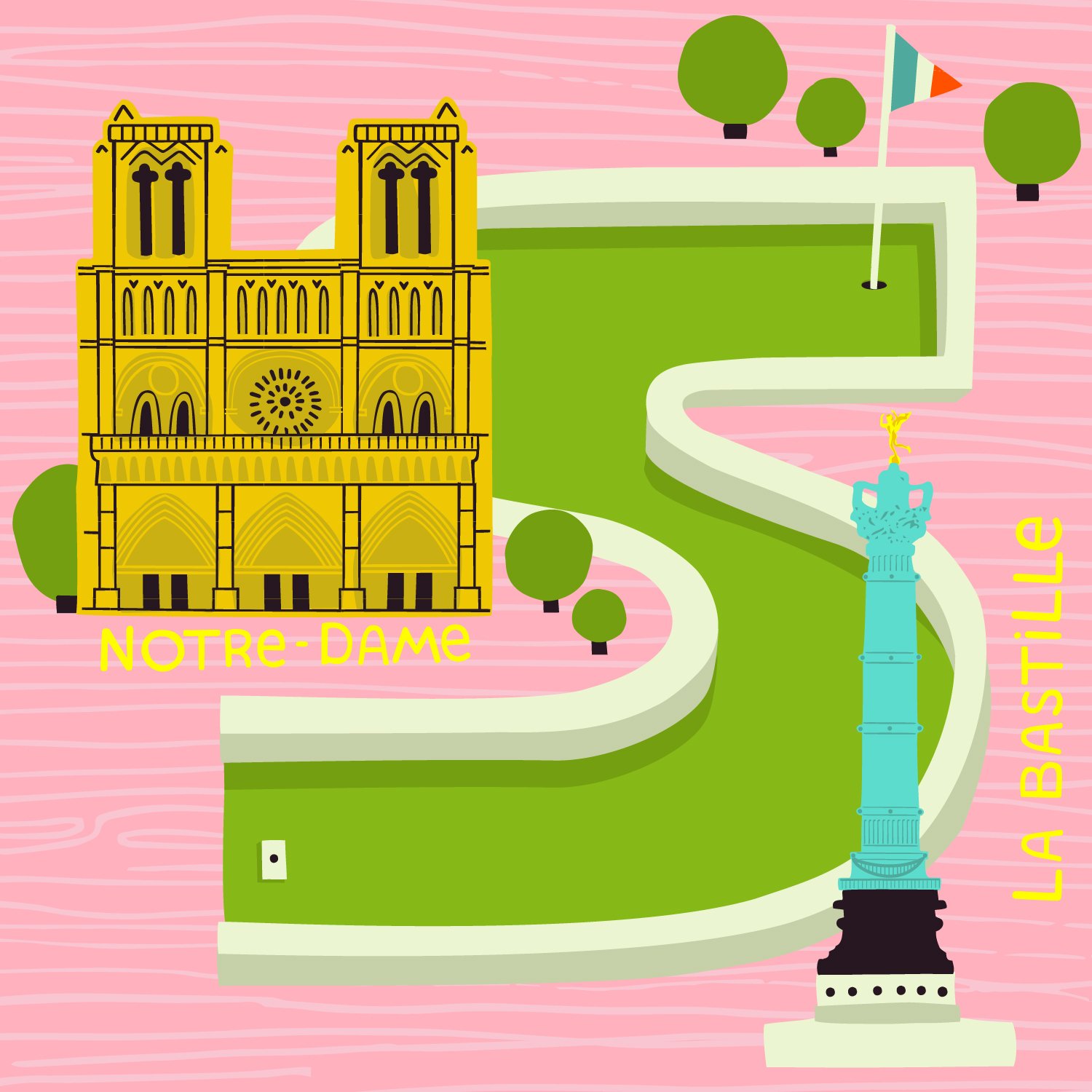
PARIS GOLF COURSE: Paris is everything everyone and every movie tells you it is! I would love to go again even if I could only go back for another 45 minutes in the Musee d'Orsay!
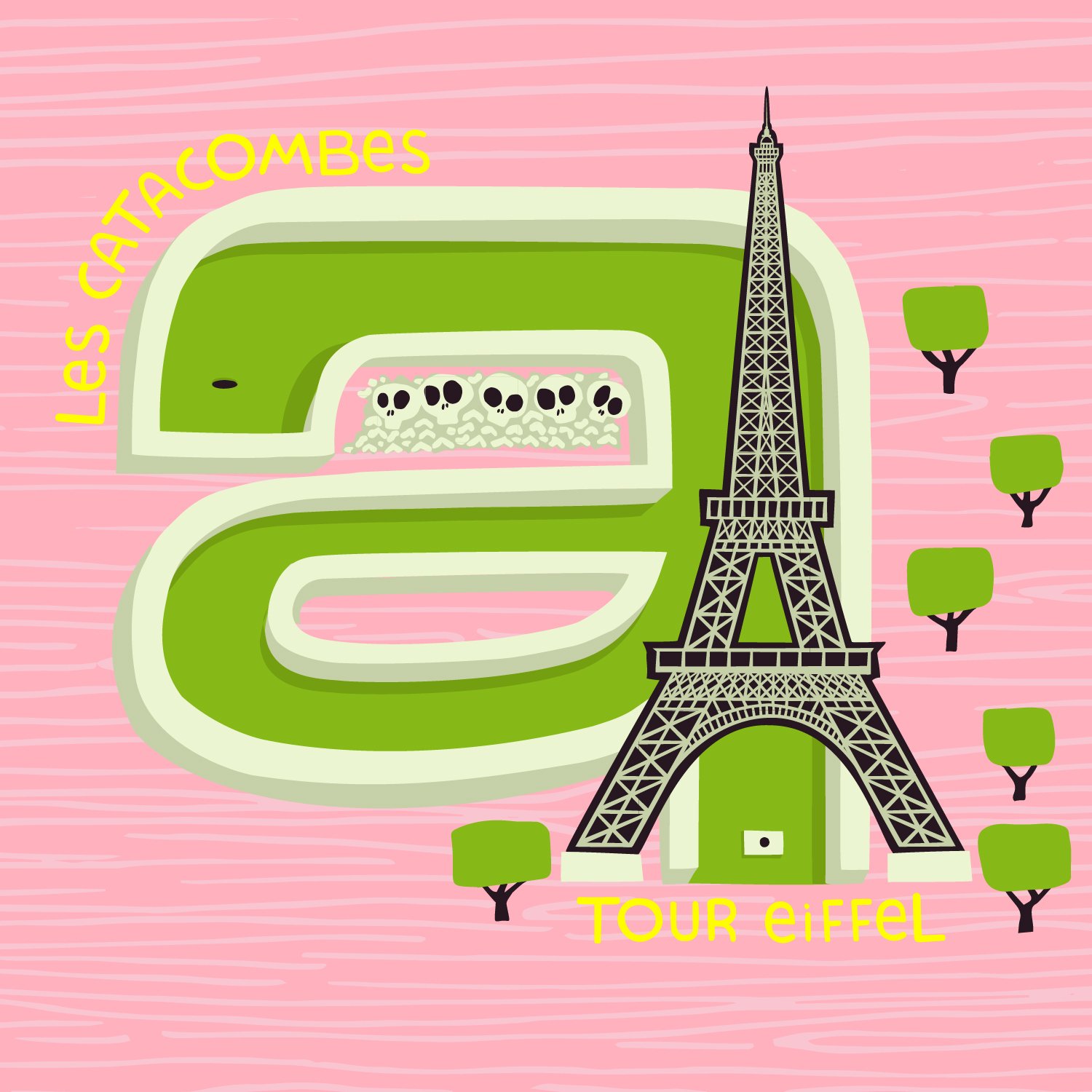
This I did not know: The Eiffel Tower isn’t black, it’s beige! I was shocked standing in front of it, what the heck! I guess I had seen so many black and white photos of it, I just assumed. Also did you know there’s an apartment at the very top! Yeah! Me either!
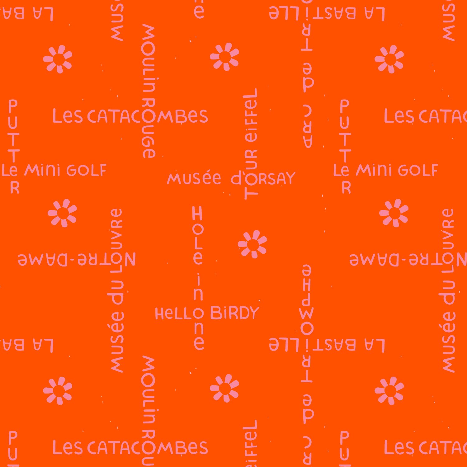
HELLO BIRDY: It feels weird to have an odd number in a collection, so when I submitted the golf balls, I also submitted this print. I took the layout of the Paris print but used my text instead and added a few flowers. I used one of my favourite colour combos, red and pink. Although what I consider red some people consider orange. If we split the difference we can call it orangie-red :D
So there you have it, the whole scoop behind this collection. Le MINI GOLF will start shipping to stores in November and if I had to guess (and it’s 100% a guess) it will be in stores January-ish.
Lots of people ask me where they can buy my fabric. Unfortunately, I don’t get to see the distribution list but when stores tag me on Instagram I make sure I link to them on my website under COLLABS and under the specific collection. Also local fabric stores will often happily bring in a collection if it’s requested.
In the mean time, we will be sewing up a storm of projects and samples that will be posted on Instagram (@lysaflower) and under Le MINI GOLF COLLABS on my website. AND of course one of my very favourite things is to see what you make! Please tag me, I’d love to see it and repost it!
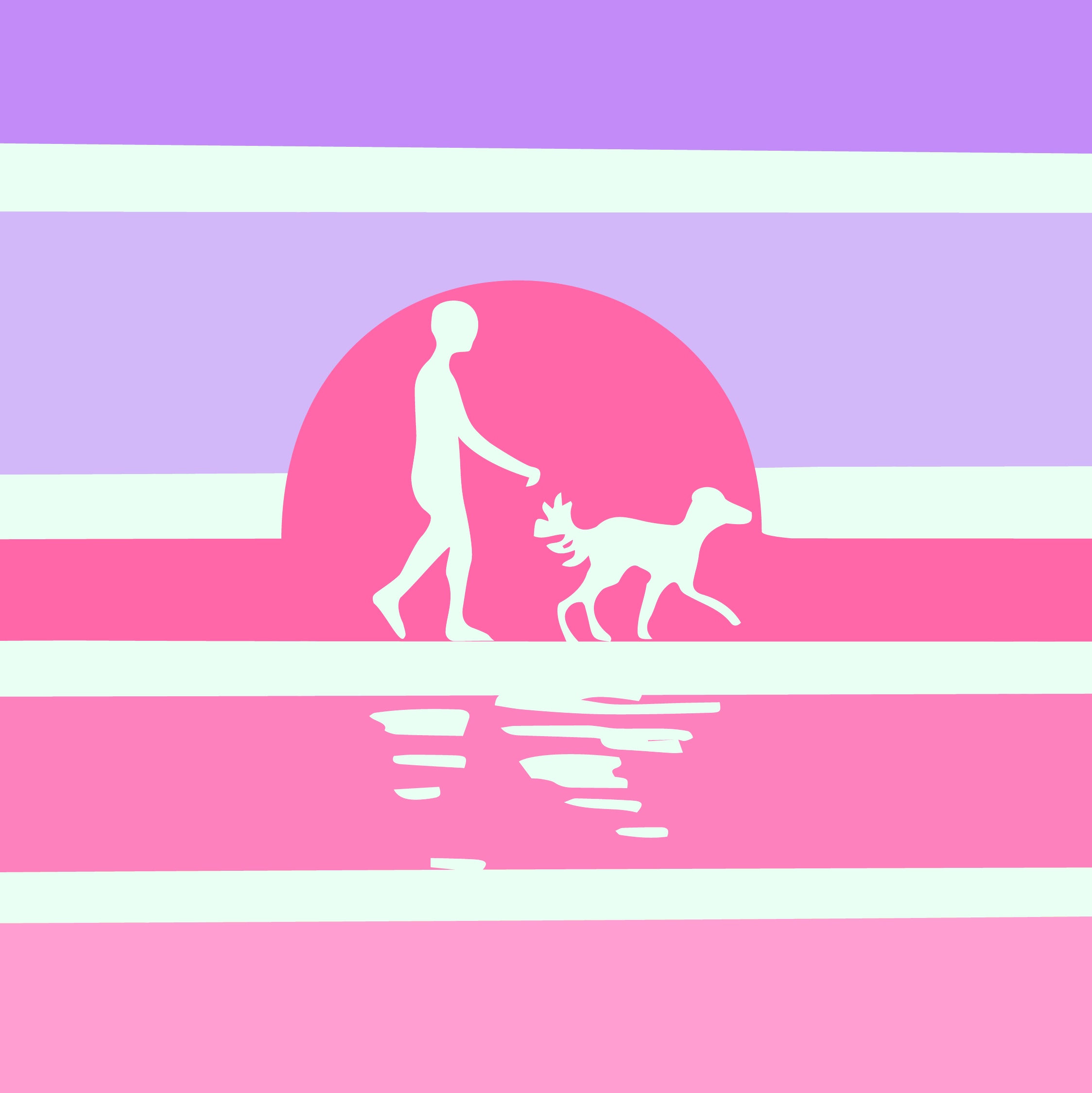
And lastly, as tradition has it, I have created a playlist for this collection on Spotify. I actually curate these and listen to them while I’m creating each collection! Enjoy! FORE!


