I use colour as an act of rebellion against the boring and the blah of beige. My sunshiny modern illustrations, prints, patterns and designs are the antidote! Here’s why…
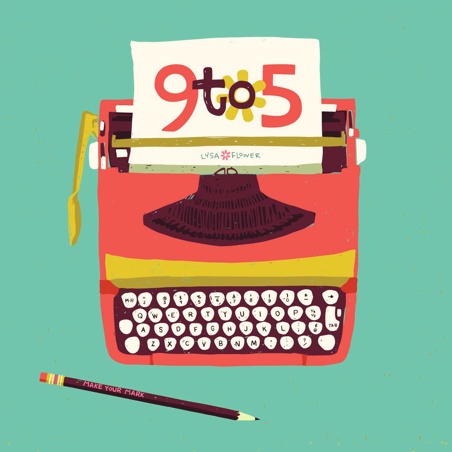
Growing up my mom was a secretary and I dedicated my 9 to 5 collection to her. That’s why there is an A on the cup, it’s the first letter of her name.
Like most moms she dressed me similarly to her taste, which was grey slacks and white blouses (yep blouses with skinny ribbons that went around the collar and tied in a bow). I also always had a cream cardigan.
The most wild colour I wore was a red blouse, but I’m here to tell you, it was the most muted of all reds. My barrettes were brown and beige and in grade 3 when I had to get glasses, can you guess what colour they were? Yep, beige!
BUT, I LONGED for the colorful barrettes and multi coloured wooly ties my best friend wore in her hair.
As a kid, when I was 7 or 8, I asked my mom what her favorite colour was. She said… wait for it…
RUST.
I looked at her blankly. Rust? I stared at her face. She wasn’t kidding. Rust.
“Like the stuff that grows on old Toyotas?” I asked.
She just looked at me blankly and said yes. Not wanting to hurt her feelings, I let it go but I walked away thinking, Rust? Rust? Is that even a colour?
At 10, I asked for my room to be painted yellow. We agreed on a colour and my mom started painting the closet and quickly decided it was WAY too bright. She promptly took the paint cans back and had more white added to them. My room ended up a shade of white, with a slight tinge of yellow. I took what I could get because the rest of our house had beige wallpaper, beige-y white painted walls. Everywhere I looked it was beige.
Maybe it’s no surprise colour is my act of rebellion. I crave it. I’ve never feared it. I can never have enough. It gives me dopamine hits like nobody’s business! When I see colours I love my instant reaction is to call them yummy! I get excited to use them and it’s my favorite part of the design process. I know some designers leave it to the end but I lead with it. I decide on a colour palette straight away.
So thank you mom! Thank you rust! And white tinges of yellow and of course beige! You have shaped me into radiating joyful, happy colours into peoples homes, neighbours and lives!

